I’m going to try something new here, and round-up the cool stuff I found each week while doing […]
The Sunday Report
Cascading Your Objectives and Key Results

In 2014, I was working with startups and this was fine. it is not fine now, and I […]
The Extra-Chunky Internet

When I first read Malcolm Gladwell’s Ketchup Conundrum in 2004, I knew it was important to the work […]
Never Take The Package Deal

If you have met Richard Saul Wurman, you have a Richard Saul Wurman story. Even 37 signals’s Jason […]
Learning from MySpace

Originally published in The Journal of Information Architecture The joy of the city is its diversity. A great city […]
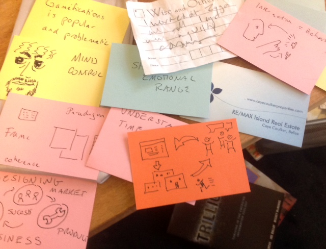
Resources for Drawing Ideas
A few months back, I started a journey. As a painter, I was confident in my ability to […]
What do I call this thing?
Since I started blogging and speaking about OKRs and how to use them, it’s been clear that OKRs […]
Diversity Is Hard

The opening keynote was a woman, the closing keynote a black man. In between there were 16 white […]
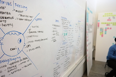
Dave Gray Makes a Concept Model
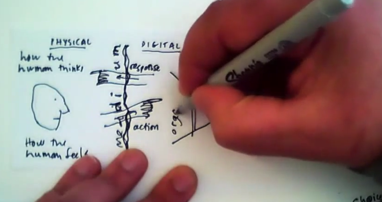
I am currently obsessed with how people diagram and make concept models. I asked Dave Gray, who is […]
An OKR Worksheet

The first time you set OKRs can be a struggle, and many folks make mistakes.
To make setting OKRs the first time easier for companies I help, I’ve written this lightweight worksheet.
101 Theses on the Design of Digital Things

101 disordered theses on design. Originally tweeted and numbering 95, it has been edited for clarity as well […]
OKR Mistakes (and how to fix them)

I’ve been having a lot of great conversations lately about the nitty-gritty of implementing OKRs as people try […]
Customer Development with Participatory Roadmaps
When we talk about Minimum Viable Product, we often forget to discuss what it means to be viable. […]
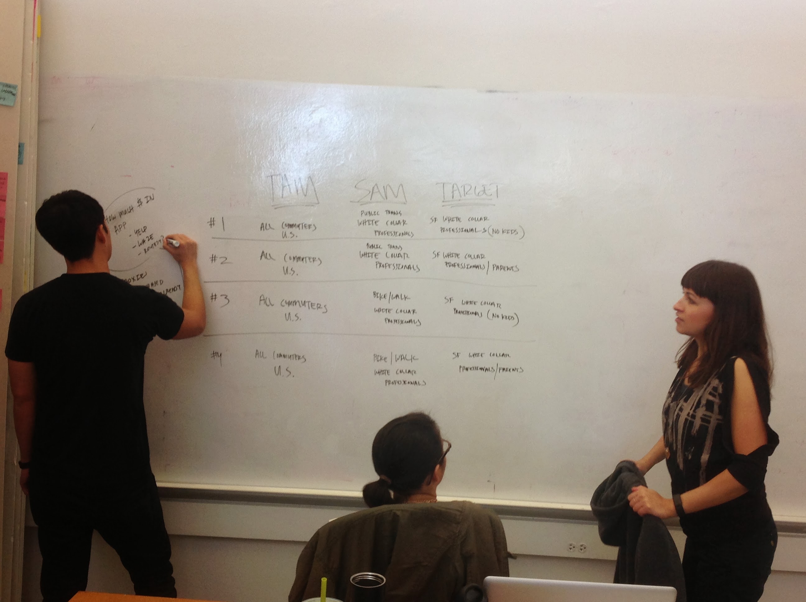
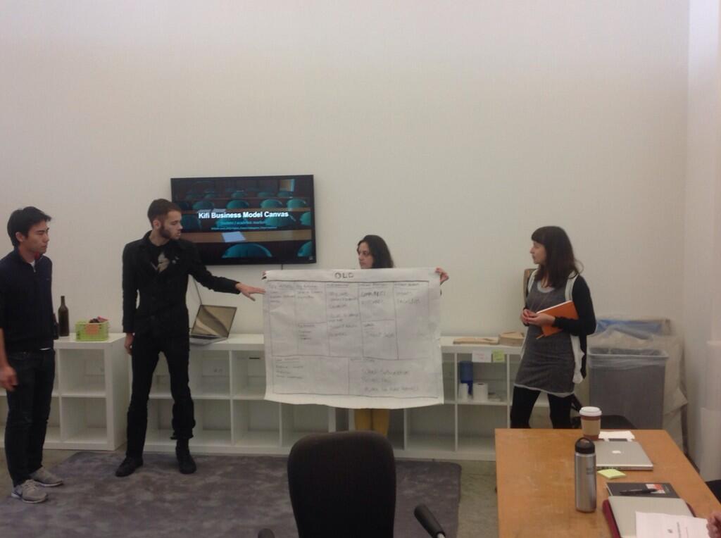
Designer as Founder Week Five
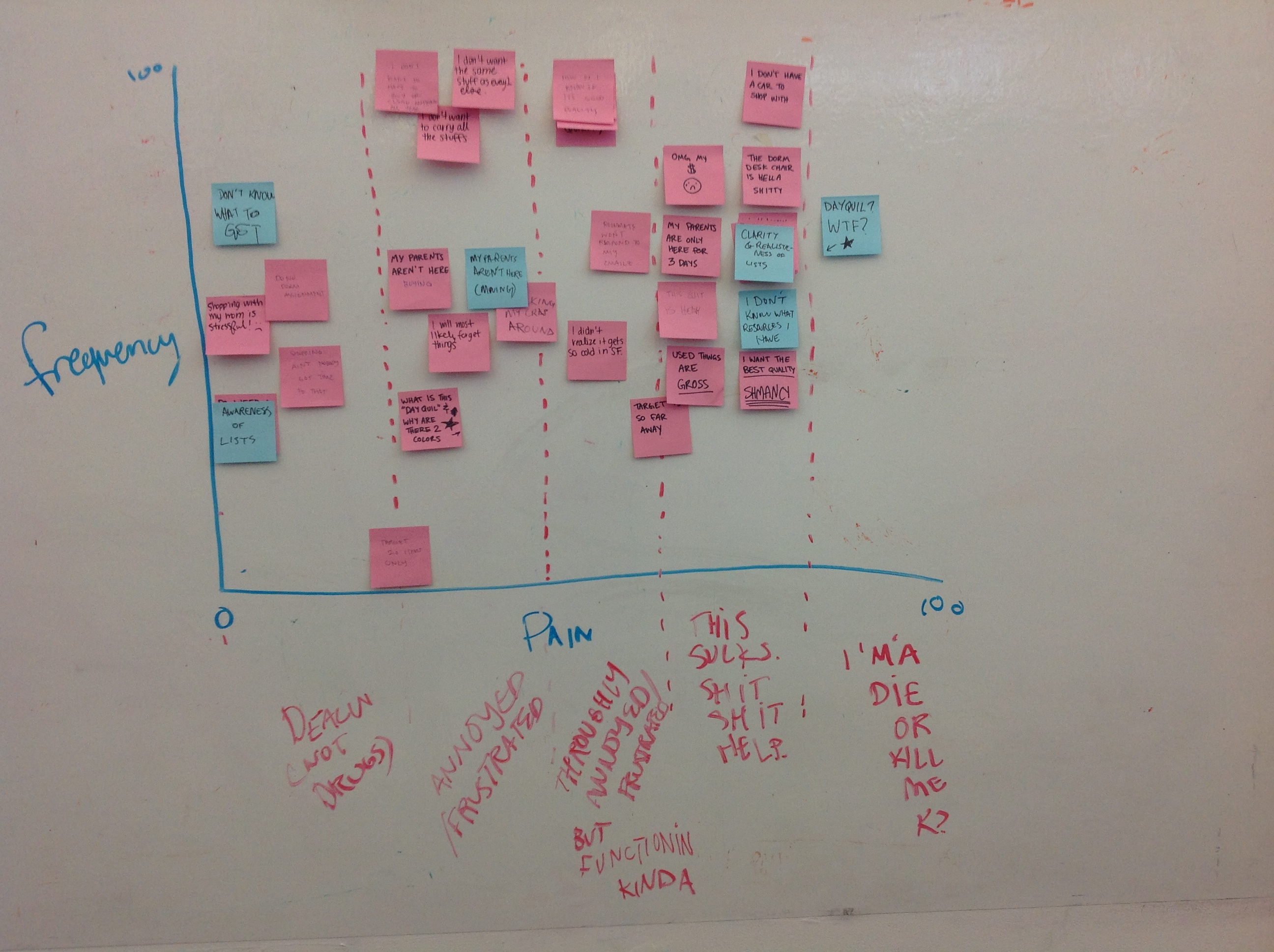
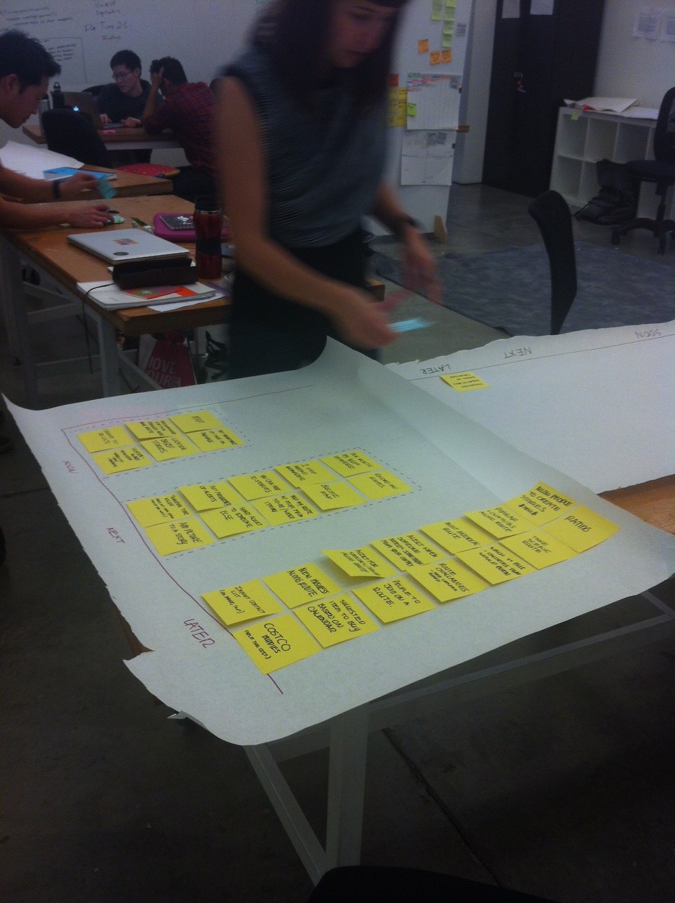
The big win of the week was an exercise we did together. Students went through the user research […]
For the Nerd People TL;DR
Abstract The paper maintains that in the epistemological shift from postmodernism to pseudo-modernism, technological, economic, social, and cultural […]
Monday Commitments and Friday Wins

Many companies who try OKRs (Objectives and Key Results) fail, and they blame the system. But no system works if […]
Towards a New Information Architecture
Warning: this is part personal history, part personal observations, and as such, it’s riddled with inconsistencies and inaccuracies […]
Designer As Founder Week Four
I return from Amsterdam to my class in varying states of uncertainty. One is already on their first […]
Heuristics for Living

If you don’t know what a heuristic is, it’s a short phrase that reminds you of a body […]
Designer Founder Class Week Three
This week I was off to Amsterdam to present Executioner’s Tale at Interactions 14. The lovely Ms Erin […]
The Executioner’s Tale
A story about a company using OKR’s to help a team focus during a pivot (yes, you may […]
Lean is Listening

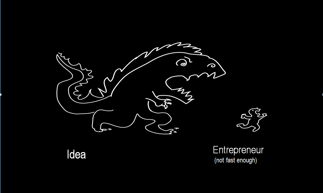
I have a lot of conversations with entrepreneurs. In them, I’ll mention something I found confusing or offputting. 99 […]
The Art of the OKR

Read the updated post, Art of the OKR Redux instead! A lot has changed since 2014…. […]
Designer as Founder: Week Two Class Notes
This week the students presented the insights they gained from talking to users and how the evolved the […]
Living Lean

If I were to explain Lean Startup as briefly as I’m able, I’d say it’s an approach where […]
Designer as Founder: Week One Class Notes
I’ve begun teaching a class at CCA called Designer as Founder. Having made that transition myself, and with […]
2013: The Top Posts

2013 was the year I started writing again, and I have no regrets, except why did I ever […]
27 Thoughts on Product Management
Riding the train this morning, I thought about what it takes to be a Product Manger. I was […]
Use Me, Don’t Abuse Me

My daughter and I are excited to see the second Hobbit movie. We expect to be scared, worried, […]
Mechanics Of Magic: Seven Lessons from Game design
Given November 6th, 2013 Full citations, slides and links