
Often, when critiquing a design, I ask how a designer came to make a certain decisions. Too often […]
Consistency is a Tactic
The Law of Conservation of Complexity
The next time you are having a big argument about design with fellow team members, and decide to […]
Why You Should Speak
At conferences and meet-ups, I spend a lot of time with young practitioners. And every time I chat […]
Lolly, Lolly, Lolly Get Your Adverbs Here
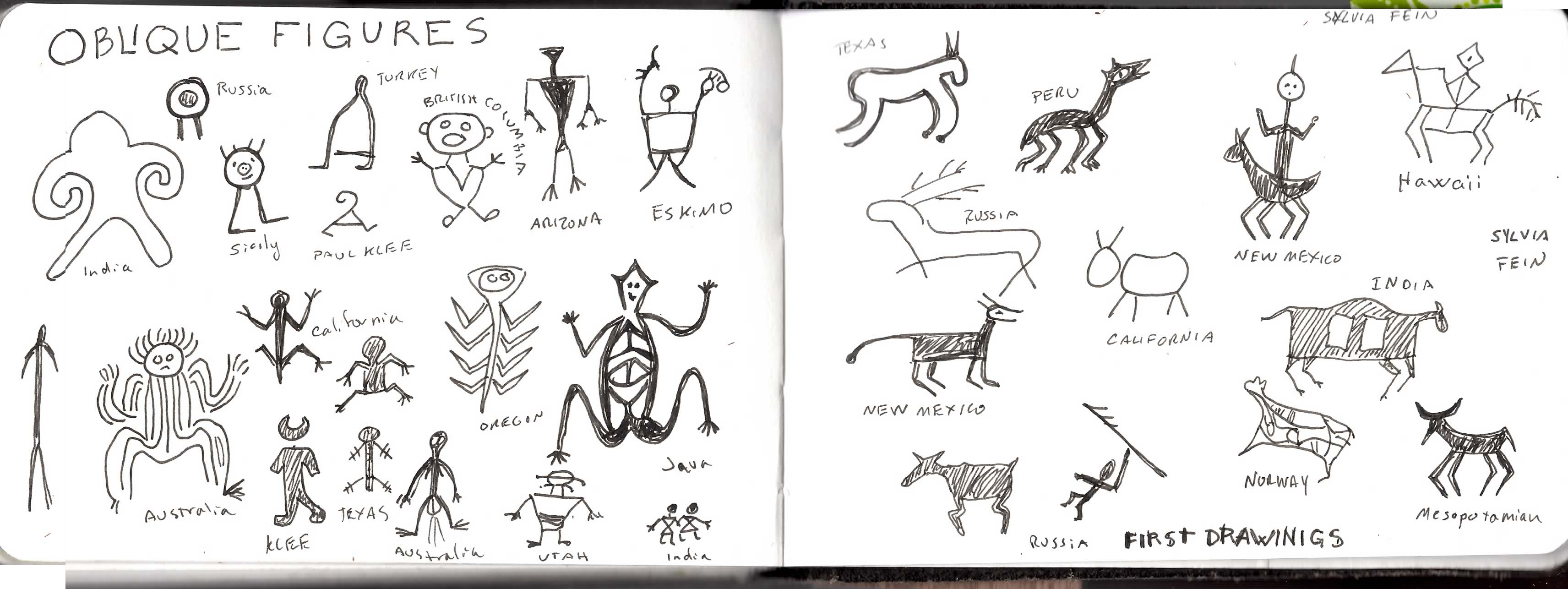
One of the most flumoxing issues I encounter when reviewing design work is misplaced interface objects.
When you craft a sentence, you’d never think to write something like “Fluorescent, she picked a red.” Somewhere or another you learned that — unless the lady in question was glowing faintly — “fluorescent” should be placed next to “red” to modify it.
Yet over and over I’ll see a design where a filter or an undo button is off in a corner, far from the thing it is supposed to filtering or undoing. I’ll hear a designer say, “well users can be trained.”
But think about that sentence again… you were able to guess the red was fluorescent, but it stopped you in your tracks, didn’t it? Design’s job is to disappear into the pleasure of use.
Next time you review a design, consider treating interface objects as if they were verbs (or adverbs) and figure out what word they affect. Then read your sentence out loud and see if it makes sense!
Imitation is Suicide. Insist on yourself; never imitate. — Ralph Waldo Emerson
I signed up for the 30 day RWE writing challenge, but have been remiss on acting on the […]
The Harry Max Boot-up Protocol (How to get going in the morning)
Harry is one of the smartest people I know, and gets a ton done. When he agreed to […]
Worlds Easiest Way to Critique a Design
I just read a lovely article on how to critique design, and it was insightful and all that, […]
Three Points of View to Get You Through the Day
My job is one of the most challenging (and most fun) I’ve had in a long time.  A turnaround is […]
I like you more than I like food
I just updated my twitter one line bio. It used to say “I like food more than I […]
The Shuffle is a Robot
When we think of robots, we usually envision something with wheels for feet, and arms spinning like the Lost and Space guy […]
The Unbearable Lightness of Travel
“Up in the Air” came out at a funny time for me. I had just taken a job with Myspace that required me to fly to LA every week. This didn’t really bother me at the time. I have always had a bizarre affection for hotel rooms, and an easy relationship with flying. It seemed to fit my new lifestyle (or at least, was no more weird.) I already had to drop my daughter off at school every Wednesday knowing I wouldn’t see her again until Sunday morning. Why mope around my Palo Alto house, sleeping with Felina and Little Fifi when I could be living the highlife on a travel stipend in Los Angeles?
So every Wednesday I wake up amidst love and squalor, enjoy a long snuggle on the couch, pack a lunchbox and suitcase, and drive to the school and the airport, in that order.  And somehow, as I take off my shoes and coat and remove my laptop, I also shed myself.
They say travel is dehumanizing. We are nesting creatures. Walk around the office. Do you see a cube that hasn’t been marked in some way? A few books, a diet coke can pyramid, a picture in crayon pinned to the low wall: all marking territory and making home.  But travel refuses you the ability to make home happen. Sure you can pack candles or a photo to put by the bedstead, but knowing a few days later you’ll have to put them back in the suitcase makes it almost worse.  Gestures of home are futile and uncomforting in the face of the housekeeper’s ability to wipe away every trace of you. I find human connections a better comfort.  I’ve squandered a lot of opportunity to explore in exchange for the pleasure of a waiter who knows I like my steak rare, or the chance to teach the parakeet in the lobby to whistle a sequence of notes. The desk clerk worries over my cough, the night watchman offers me tea.
What’s Wrong with Wireframes?
After an extensive search, I find I have not written this down (at least in a blog– I have referenced it in talks.) Now, most of these points can be/have been addressed in one way or another. But one might ask yourself, what other deliverable is as criticized as wireframes, and could there be something better?
Firstly, wireframes emasculate the designer. Wireframes have often had a place in multi-disciplinary teams where the graphic designer had come from print, and didn’t really understand interface design. The interaction designer came from software and was making ugly terminal-esque interfaces. So in order to make sure the end result was palatable, the interaction designer (or information architect; I’ll use this term interchangeably in this post) would make a pig, and then the graphic designer would put lipstick on it. This was 1998.
But as designers got savvy to interface, they started resenting the restrictions on their ability to creating compelling and useful designs. After all, a designers toolkit is essentially font, color and layout. The web browser stole the first, if the IxD steals the third they are relegated to the sorry position of kid with crayons handed a coloring book. Think hard of the last wireframe you saw. Didn’t it look a lot like a paint-by-number, with only the numbers missing?
How to Hire a Designer
A few days ago, I read an article with the same title as this post. Oh, maybe it was How to Hire a User Experience Professional, or Interaction Designer or Information Architect, or whatever. I don’t recall. There isn’t so much difference anyhow. I do remember it said things like “look at their presentation skills”, “see if their personas are based on research” and something about their wireframes. I tweeted that’s why I wouldn’t hire a designer, which caused some kerfuffle with my followers. And it’s hard to clarify in 140 characters what teed me off about the original article.
Here’s why I wouldn’t hire someone based on wireframes, Powerpoint and persons: it’s not because these are necessarily bad (well, except the wireframes, which are so 2001 that they are the mullet of deliverables, and like the mullet I cannot wait until they are finally gone and I’m not asked to stare at them any longer.) I was bummed because these are merely artifacts and not necessarily the vital critical thinking skills you need to find in a decent designer.
I really don’t care if you never do personas, or if you make them up from a guy you talked to in the grocery story. I don’t care if you use keynote, Powerpoint or Illustrator. And honestly, I would hire someone if they did wireframes even though I hate the darn things.
So how do I vet designers, if not by their paperwork?
Give Up Your Resolutions

For the last five-some years, I’ve given up making New Year’s Resolutions. Instead I have what I call the New Year’s Project. Each year I pick a large topic, and spend my time on and off throughout the year teaching myself about it. One year it was futurism (an obvious topic, consider how many New Year’s predictions articles always get run). I read up on who were the leading futurists, joined a futurist group and went to their meetings, and worked on making predictions myself. I learned useful concepts like cone of uncertainty, and how to take the long view, and how to do scenario planning. But most importantly I learned we cannot know the future, and as we try to plan we must be always ready to shift. That doesn’t mean we shouldn’t keep trying to plan; it just means maintaining a yogi-level flexibility.
This last year I decided beauty would be my project. Not art and architecture, which I have always appreciated, but traditional feminine beauty. I have always had an uneasy relationship with the ideals of feminine beauty– having been raised a feminist I suspected makeup and infrastructure garments were a tool of patriarchy to hobble us by taking away two hours of our life every morning. But hey, why not question my assumptions?
Earthquakes
In 1923, Frank Lloyd Wright completed the Imperial Hotel, a building commissioned in Japan. In 1923, there was a 8.3 magnitude earthquake. The hotel survived.

Wright was a midwesterner like myself, and had no experience with Earthquakes. When he arrived in Japan, that lack of familiarity was his strength; he passionately researched earthquake damage, and designed his hotel with multiple safeguards.
Terms of Art for the Heart
A term of art is a word when used in a professional context has a very precise meaning. I’ve been reading a lot about game mechanics and theory, inspired by Amy Jo Kim’s terrific talk given recently at Linkedin. Right now I’m half-way through A Theory of Fun by Raph Kosterner. It’s an odd, rambling book, and most it is familiar to anyone who’s been doing interaction design for awhile. But I do notice that game designers talk about emotion much more than we do, and they are crafting new terms of art and taxonomies that could be useful to anyone doing interactive (and particularly social) design.
Good Morning, Everyone
Welcome to a new and simple eleganthack design, finally live. The old eleganthack I’m moved to archives.eleganthack.com, and this lifestream blog I made my main interface. I kept thinking I’d do some fine tuning then starting writing here again. Six months later I realize the important thing is not to fuss around with it endlessly, but to get to writing again (and fussing endlessly will come when I’m procrastinating on writing.) You will have to resubscribe to the RSS, sorry.
So you’ve been wondering, what have you been up to, wodtke? Well, reading a lot about architecture, which is a passion I pickup after I wrote the chapter on social for my book. The result (so far) has been some insights on how the classic understanding of space can be applied online. I’ve presented this at IDEA, and I hope to further develop and extend these ideas at Interactions 10 Here are the slides from IDEA.
a makeover for eleganthack
My blog gets varying levels of love. Sometimes I’m posting all the time, sometimes a month or two […]
Twitpoll: do you Yammer?
Twitpoll: do you Yammer?, originally uploaded by Box and Arrow. small sample size…. but resonates.
NYTimes associated navigation
NYTimes associated navigation, originally uploaded by Box and Arrow.
My new baby.
My new baby., originally uploaded by Box and Arrow.
New Article at Boxes & Arrows on Prototyping with XHTML — Anders Ramsay.com
Anders says The first time I heard about designing with XHTML was in 2005 at an IA retreat […]
travels with amelie
IMG_2302, originally uploaded by Box and Arrow. Now it Italy, but had a brief stop for a birthday […]
So there *are* IAs in France!
Finally a sign of Information Architecture (IA) life in France! It’s been a running joke in European IA […]
Context is King!
Nasty as they wanna be? Policing Flickr.com Except rules are tricky things with an operation like Flickr’s. The […]
3 Kinds of Free
3 Kinds of Free, originally uploaded by armanz.
anatomy of a leaderboard
anatomy of a leaderboard, originally uploaded by Box and Arrow.
Why community is hard
Community is hard, and so is pretty much all social stuff. But why is so darn hard? Why […]
Size Matters
early draft of a section from 2nd edition of blueprints We all would like to think there was […]
When tags work and when they don’t: Amazon and LibraryThing
Thingology (LibraryThing’s ideas blog): Both LibraryThing and Amazon allow users to tag books. But with a tiny fraction […]