Why some designs won’t ever stop sucking
Again, it starts on ze twitters
I have a phrase, "Unlearnable design," for when something is so counter-intuitive you keep making the same mistake over and over.
My example: I always click the comment icon on twitter to read comments. Does not work (if it did, might improve dialog.)
Do you have one?— ~c (@cwodtke) May 26, 2018
Intuitive is one of the most used terms in tech. Everyone wants their app to be intuitive. It’s worth asking what intuitive means, really? Working Knowledge offers this definition
Intuition is compressed experience.
Which means for an app to be intuitive (or more correctly, intuitable) it must be consistent with the end-user’s experience. Some product folks think that means if Apple or Facebook does it, they can too. For example, the unusable hamburger menu. But your user’s world is bigger than the hottest bro-co, and even the big guys make mistakes.
To make interfaces truly intuitable, we have to understand metaphor and analogy. and I don’t mean

But rather how our human experiences shape our perception of everything. We are going back to Lakoff and Johnson in Metaphors We Live By.
Metaphor is fundamental to how we think.
— Lakoff and Johnson
Hofstadter agrees “… all meaning comes from analogy.” And let’s not forget Mr. Understanding himself, Richard Saul Wurman:

Embedded Metaphor
Let’s start with all the hidden metaphors we have in our daily life. For example, what direction is good?

I asked my students during lecture if good was down, and no one raised their hands. Good is up.
It’s in our language.
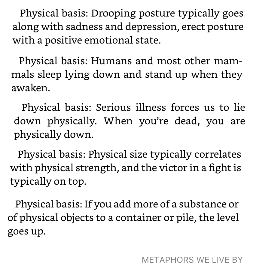
- I’m feeling up.
- That boosted my spirits.
- I’m feeling down.
- She rises early.
- Wake up.
- He’s at the peak of health.
- He’s under the weather.
- I am on top of the situation.
- He is under my power.
- My income rose last year.
- The error rate is low.
These all come from our bodies, as Lakoff/Johnson point out.
Our perception of the direction of the future are more cultural than physical, but it’s still a good bet you know what direction the future lies

- In the weeks ahead of us…
- That’s all behind us…
- I’m looking forward to seeing him.
- Back to the good old days
So what does this have to do with design? Information design is an obvious place to start. If vertical is good-bad, and horizontal is time with future to the right, these charts do not need labels.
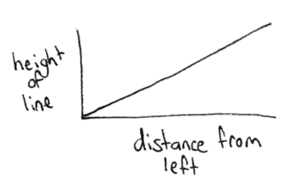
As you look at the chart, what does your brain narrate? Mine says, as the line gets higher, the distance from left gets farther, but it also says things are getting better over time.
One day I asked a fellow Product Manager, Ben, how he was doing and he said “Up and to the right!”
We don’t need y & x labels for the charts below because of that underlying understanding created by many many other charts, built on the metaphors in our language.
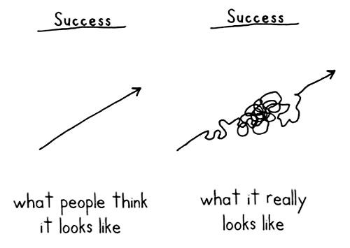
Which enables New Yorker cartoons.
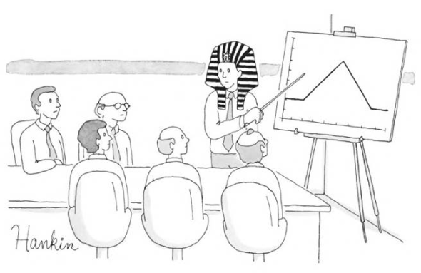
So the chart below makes me insane. It makes logical sense, but not intuitable sense. Time is rendered right-to-left, and the very best state is down. The chart is drawn that way to cohere to the axis directions, but the end result is it’s hard to read.
One of the signs of a counter-intuitive (or unlearnable) design is a label. Unlike the cartoons above, someone had to add a “start here” label. All designers *should* know to avoid this kind of bandaiding because they all should have read Design of Everyday Things.
Doors with poor affordances need labels. That’s because they violate our expectations. What is an affordance (or signifier, if you’re a second edition person) but a message written to users in the language of design! And it’s written either fluently in the language we know or mangled like a first year french student. See below.
Norman doors. So many goddamned Norman doors. — anne gibson (@kirabug) May 26, 2018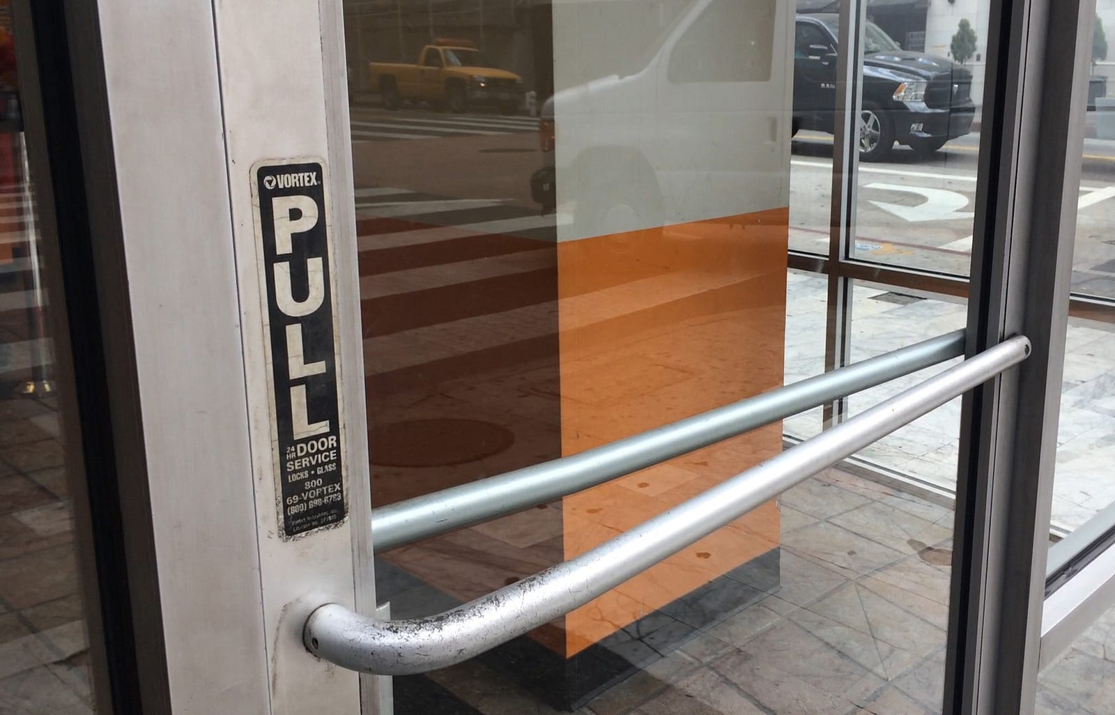
Instead of adding a band-aid, redesign the object with a paradigm that matches the end user’s mental model. For charts, increase your visual vocabulary.
That Hobgoblin, Consistency
Many designers talk about consistency without a clear idea of why it matters. They seem to think it means using the same color of red or the button style in the company style guide. It’s so much more. Great consistency means being consistent with the world of the user, which does not begin and end with your company.
Consistency begins with understanding your users are humans who grow up and someday lay down to die, who walk forward into the future and look back at where they’ve been. Consistency means knowing the doors they’ve opened and stoves they have turned on. Knowing the good things in the user’s life and recognizing the bad.

A good designer also knows that in the last decade or so, users have learned a new language of the web. A few web interactions have become cannon, including going to the homepage, clicking back and saving.

The save icon, based on a now non-existent floppy disk, is widely recognized as “save.” This gives some hope for those who love the hamburger menu. Perhaps someday it too will become part of our language. Or it may prove unlearnable. Jury is still out.
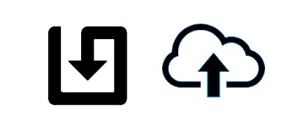
More interesting (to me!) is how the save icon is evolving, arguably forced to by the words download and upload to the cloud.
Peck’s download icon is particularly smart as it mimics the old icon’s shape while leaning into the metaphor of down. Language evolve, icons (a visual language) can too.
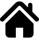
Home is deeply embedded in our consciousness, from literal homes to Rivendale’s homely home to a game of tag where you can be home free. Home icons, based on a child’s drawing of a house, are consistent with the language of western culture.

Back is also widely understood (although forward and reload less so.)
Back at Yahoo in 2004ish, we did SO MUCH TESTING and we used to joke the only thing users understood was the back button. It’s not surprising, considering
- it’s based on the cultural metaphor of moving backwards to the past
- it works the same way no matter what website you are on (mostly)
- all browsers adopted this metaphor
It’s even adopted in other contexts, such as reading a book (which makes some sense since we call them webPAGES.)
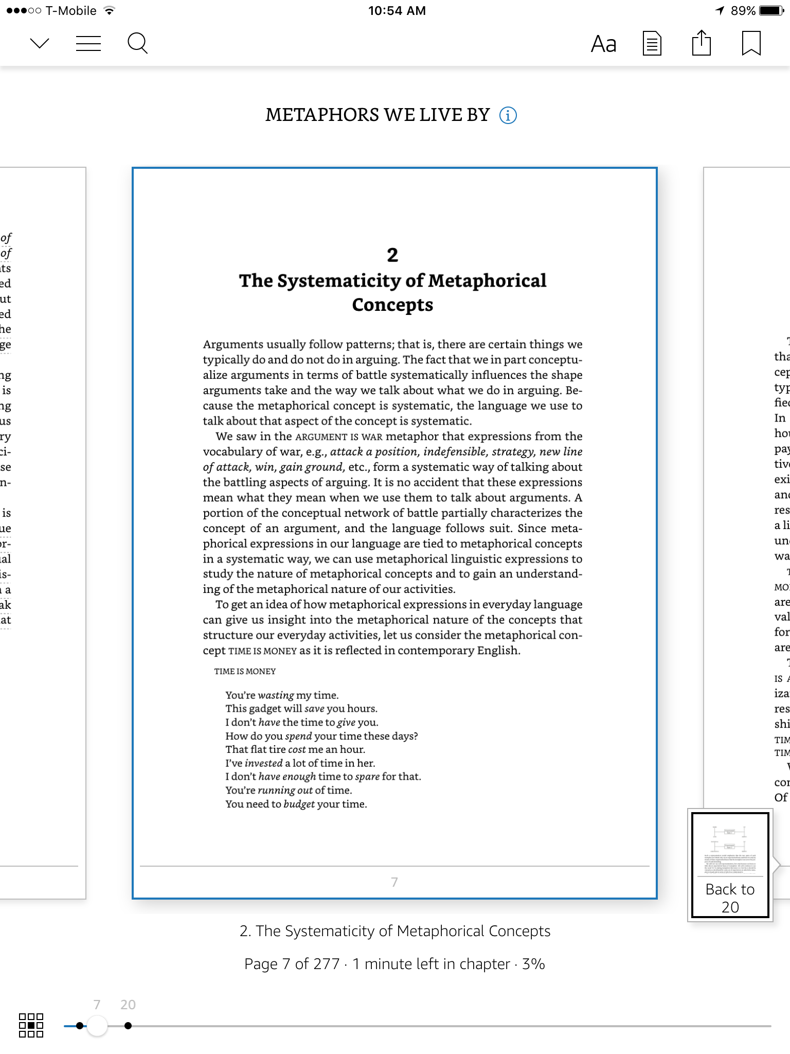
Sadly the Kindle interfaces aren’t consistent with each other, creating this unlearnable design moment on the ipad version:
The down chevron minimizes the book, yet I always click there when i’m looking for the table of contents. I never click on the hamburger menu next to it until I’ve first failed with the chevron. I have literally clicked on the wrong icon a hundred times. I assume because the chevron has been used for the last decade to open and close menus (usually flipping direction to indicate open and closed) I think it should open a menu.
Dear Amazon design team: just because the chevron has been used inconsistently in the past does not mean it’s up for grabs semantically. It means using it may confuse people.
As well, I keep looking for an X in the upper right to close the book. Because that’s what everyone else does, from browsers to pop-ups.
And where has back gone?
I just…

Great, now I’m tired. I’m going to duck the question of magnifying glass as search vs magnifying glass as zoom. But think about it. Please.
In Hopes of Ending This Rant
There are a lot of reasons designs are unlearnable I haven’t covered. For example, only considering one use case (then not usability testing.)
My credit union transactions — there's a check icon and an image of a check, and I always click the image of the check to view the check. But that does some other random thing. To view the check you have to click the text link. I've been unable to learn this for 10+ years. pic.twitter.com/lRJYO0E26k
— Jan Benway (@JanBenway) May 26, 2018
Or my original whine, really.
Why twitter designed for making responses but not for seeing what people have already said is beyond me. This design might even explain why twitter is the best platform for getting into fights with reasonable people (fights with unreasonable people is a different topic. )
Some unlearnable designs are harder to figure out, like this example:
These freakin' icons. I never select the right one. pic.twitter.com/e3AyUViRTM
— Clifton B 🍁 (@CliftonB) May 26, 2018
From the plethora of responses, it seems Clifton and I aren’t the only one who have this problem. (my guess on a fix? Put them closer together, not farther apart, to force more thinking about which are what. But this example doesn’t violate any standards I can think of… it just don’t work. More research indicated.)
But they aren’t all mysteries!
Too many unlearnable designs are caused by the product folks not looking at the world beyond their office. It’s the not invented here syndrome. It’s the those who do not learn from history will make bad interfaces syndrome.
When an interface is intuitive it matches the user’s mental model.
Look beyond the company’s style guide, and see what the people who use your site also use. Not just websites, the world. What do their appliances look like? How do they talk? What metaphors do they use?
Design something that is consistent with your customer’s world, not your company’s worldview.
Then test, test with a new use case, and redesign not NOT patch with a label, and test again.
Then test again.

Want more? Deck from lecture on this and related topics.