Part One: Rendering Relationships
Sign up to be alerted when Pencil Me In, my book on visual thinking, is available.
I’m gone a little crazy for concept models. It started with when I wrote, How to Make a Concept Model, and then when I followed up with Five Models for Making Sense of Complex Systems.
They are sometimes called Conceptual Models and sometimes Concept Models. I prefer the latter. Other than being shorter to type, I like the symmetry of a concept sketch and a concept model. Both are ways to message a concept. One is for a system, another for a surface.
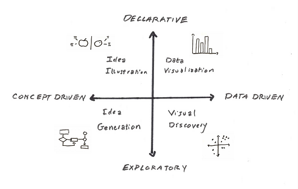
I also like the parallelism with data models. Sometimes one models data, sometimes one models concepts.
The chart on the left shows the two ways we use concept models (and data models.)
We sketch to explore, then — when we’ve gotten clear on our ideas — we illustrate those ideas to communicate them to others.
Let’s start by agreeing that a concept model is a visual explanation. I want you to see things the way I do, so I draw a model made of words and pictures so you share the picture in my mind.
What if I want you to understand that design tends to wander around exploring options, but don’t worry because eventually we’ll pick something.
I might draw this:
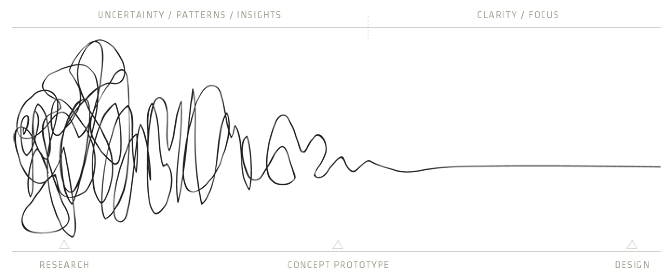
Pictures > Words. Especially when you are talking to impatient people.
Like language, visual communications abstract and schematize; unlike language, they use properties of the page (e.g., proximity and place: center, horizontal ⁄ up–down, vertical ⁄ left–right) and the marks on it (e.g., dots, lines, arrows, boxes, blobs, likenesses, symbols) to convey meanings. — Barbara Tversky
This is what makes up a visual vocabulary. Proximity, place & marks.
When you begin to create a concept model, you inventory of all possible elements. Then you determine the relationships between the elements, and that tells you what kind of model you are drawing.
I think there are three types of relationships that concept models depict: System, Process and Comparison (pulled from Dave Gray’s Organization approach). You need to be able to represent all three in order to be effective in your work. Sometimes you need to combine all three in a single model.
System Concept Model

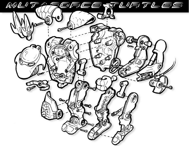
The job of this style of concept model to explain the elements of the system and their organization. The “exploded view” diagram used by industrial designers is a fun example.
Creating a concept model can be a powerful way to think through a design challenge. Digital product designers create concept models before they design the flows and UI of a system. Once they’ve determined a model and designed the entire system, the model remains as a way to help the rest of the team understand the design holistically. (see example)
It’s a lot like architecture. Below is an architectural bubble diagram.
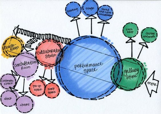
Architects use bubble diagrams to think through the flow and the relationships of the room without getting caught up in the problems of door placement and exact proportions.
In architecture and interior design, you begin with the ‘program’. The program is a list that itemizes the spaces that must take place in the building. The program serves as an outline of the requirements of your building and describes spaces with assigned square footage and description of function, use or activities.
The main purpose of bubble diagram is to help you to translate the program into a strategy for form. Bubble diagrams simplify this step by graphically depicting the program and allowing for quick expressions, multiple layouts and revisions.
This is what creating a concept model does in early stage information architecture, game system design, interaction design frameworks, or anytime you need a strategy for form for a navigable digital space.
Here is concept model/bubble diagram for the website for Charter for Compassion
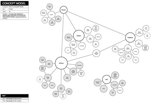
Another, by Susan Mollar, for a Mutual Fund Investment Company. This one is even more bubbly.

In a digital product, the elements might be layered, or parts of a whole, or overlapping. Vary the size of each element to express importance.
Since there are so many different types of concept models, it might be wise to adopt the term from architecture, bubble diagram, for when we’re talking about early stage product architecture.
Here are the thinking and explaining versions of a model of the roles the Institute of Information Architecture plays.

Process Concept Model

This model shows how one things leads to the next. It usually describes a series of events, like a story or instructions.
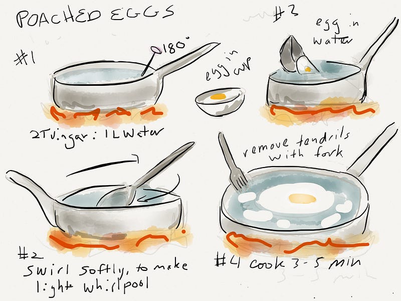
Process models tend to fall into two camps, loops and arcs. (Right click and open in a new tab this brilliant article on arcs and loops by Daniel Cook, because you’ll want to give it your full attention after looking at my collection of pretty pictures.)
Arcs have a beginning, middle and end. Loops a series of steps you repeat, possibly endlessly. You can combine them, of course!
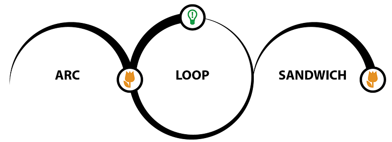
Game designers often draw the game’s “core loop.” They’d like you to hang out there endlessly.
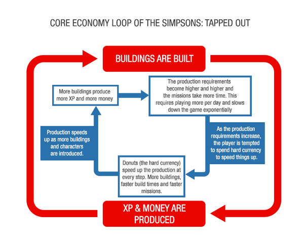
Process designers draw a better way to work. Here is the Walt Disney Movie “flow chart for making movies” with a start and end point. Despite being depicted as a circle, it’s an arc.
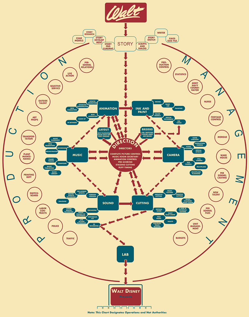
Walt Disney distributed this creative flow chart, which shows how a feature comes together, in 1943. The chart sketches the creative process from story development to the final edit. At the center are the directors, with the sound, music, camera, cutting, animation, and ink and paint departments in the next inner most layer. Production and management make up the perimeter and are delegated into sections like budgets, art props, and transportation. Arrows trace out the chronological steps, starting with Walt at the very top and ending with the movie’s theater debut pictured at the bottom.
— Michelle Debczak, Mental Floss
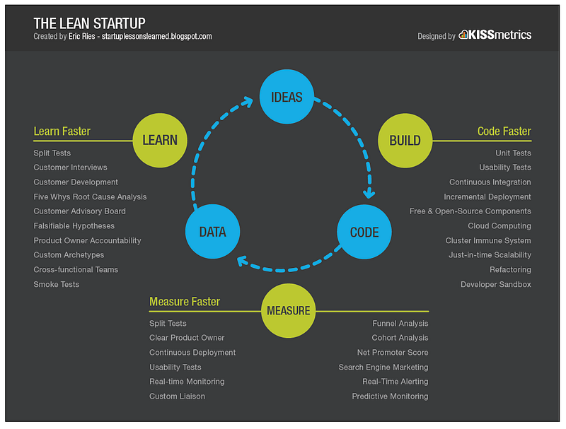
The Lean Startup is drawn without beginning or end. It’s a loop.
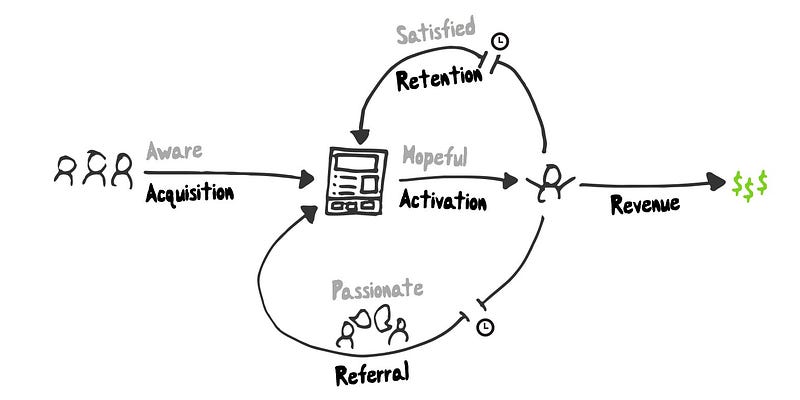
This is David Bland’s model of the User lifecycle. It does have a beginning and end, but looks like there is a core loop in the middle….
The Process Concept Models that Digital Product Designers probably use the most are flows and journey maps.
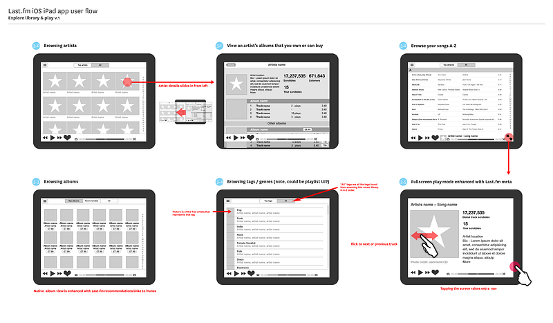
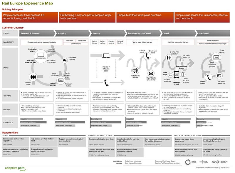
Heaps and heaps have been written about both of these, so I’ll just point out that once you recognize they are concept models you should be able to to use your nascent visual vocabulary in order to communicate effectively.
Models for Comparison

What is the difference between us and our competitors? What do different kinds of players enjoy? Which model should I use? In life, we have many choices, and it’s useful to be able to visualize the differences between them.
The 2×2 is a common comparison format. It can be drawn different ways, but it always represents opposing concepts, and where elements exist along that continuum. Here is one from Dave Gray for models!

Below is another Dave Gray comparison model for models (meta!) but this time it’s a 3×3 grid (and see, there are our three kinds of relationships across the top.)

In both cases, axis represent continuums, and the intersection of continuums allows new things to emerge. There is always an axis, even if we forget it exists. SWOT analysis is a great example.
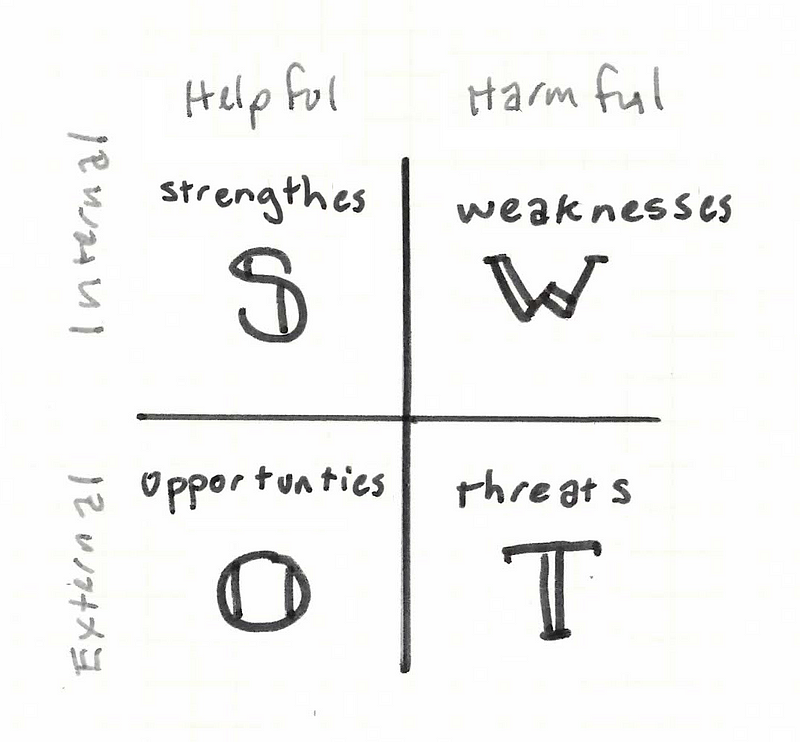
Another great 2×2 is the Johari Window. This is a model for getting to know how others see us, and thus understanding ourselves.
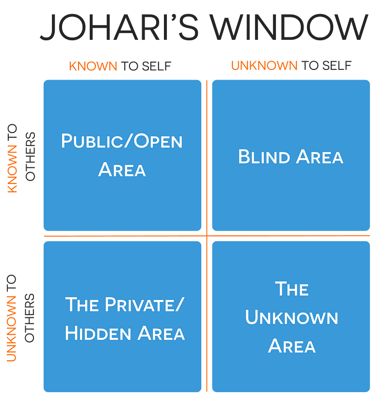
The windows change over time. By collecting feedback, we can reduce our blind spots. With trust, we can reveal our hidden areas to others. And over time, through experience and interaction, we can even discover things about ourselves we didn’t know.
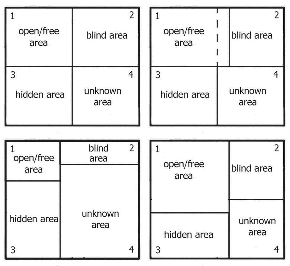
Of course, A comparison doesn’t have to be an obvious grid, nor does it have to be a 2×2.
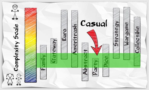
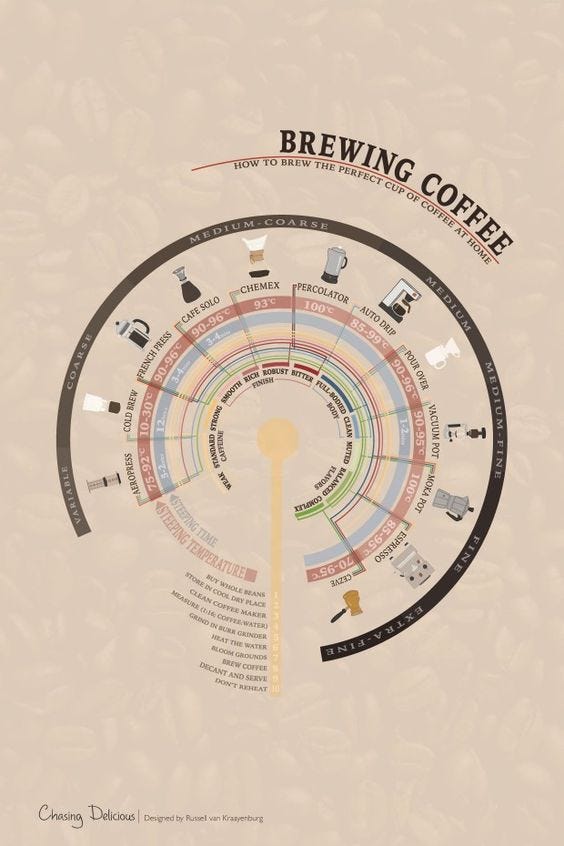
In fact, you have a lot of choices for how you tell your story. But by now, you should be able to spot and name the hidden axis.
Combinations & Metaphors
Many of the ideas we wish to communicate have more than one type of relationship happening. For example, if we want to describe how people change over time, we need to use both Process+Comparison.
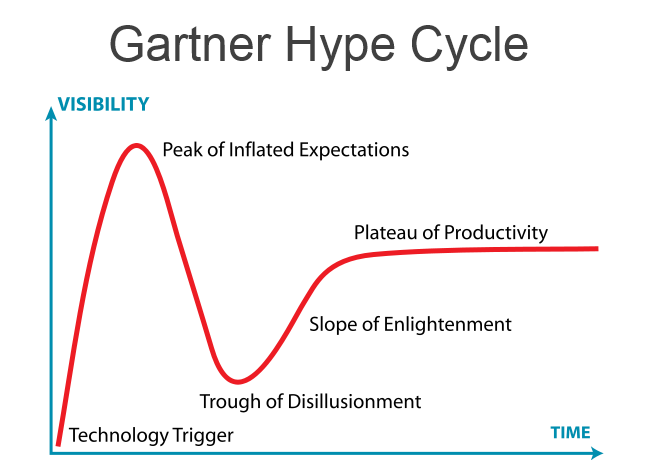
The Gartner Hype Cycle is a pretty typical example. You’ve got two axis, one is time and one is customer interest. It’s rendered without any metaphors.
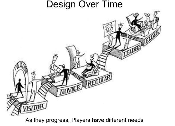
This one by Amy Jo Kim shows how user needs change over time in a game system (like a MMO.) The hidden axis (I’ll argue) are time and consumer < — > co-creator. This metaphor suggests islands and bridges, or maybe a theme park experience.
Moving left to right is a common metaphor for change over time in Western Culture.
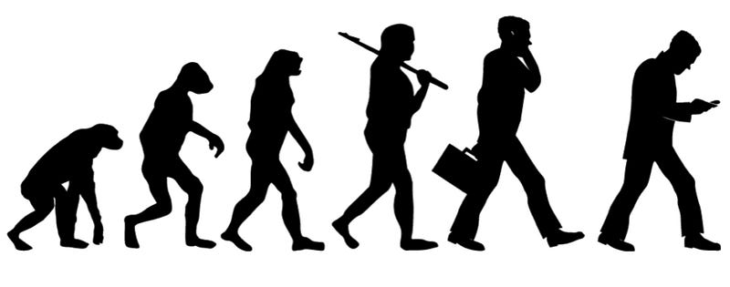
But so is moving upwards.
I’m sure you recognize Maslow’s Hierarchy of Needs. We are comparing people at different stages of getting their needs met. Basically, as soon as we solve one problem, we start working on the next, less urgent one.

The choice of a pyramid metaphor suggests a couple of things.
- You build the base before you can move to the next level. Up as seen as forward progress.
- Pyramids narrow as you move up, which suggests not everyone makes the climb. Some people will stay at the bottom of the pyramid, through choice or circumstance.
Maslow’s pyramid is so famous, many have riffed off it to demonstrate other beings moving to a “higher” purpose.
Stephen P Anderson uses the Maslow pyramid metaphor to to describe how companies evolve their design concerns as they become more sophisticated in meeting user needs.

David J Bland uses the pyramid metaphor to talk about targeting the right customer. Potential customers move from having a problem to realizing it’s a problem to seeking to solve that problem….
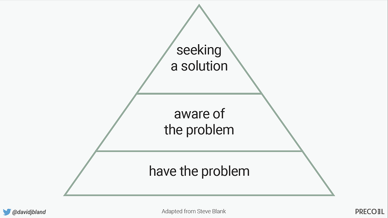
But let’s pause for a second… is this the right metaphor?
If it’s the users moving from experience to awareness, sure, but if David’s talking about narrowing down all potential customers to choosing the right people to target…. it could be a funnel.
Here Laura Klein’s model of the classic funnel I’ve seen at every company I’ve ever worked.

So can we redraw David’s pyramid as a funnel?

Does it make more sense? Or less? (both could be true: I’m not in David’s brain! And I can’t find the Steve Blank quote he’s working from, so I’m making up variations to make a point.)
The visual metaphors we chose can be the difference between clarity and confusion.
When I interviewed people on how they made concept models, they said talking to yourself is an important part of the process. You talk as you draw, and listen for the language you use — “the company’s evolution” or “narrowing down to the customers you can reach” — then find the pictures that represent those ideas.
For example, if David had said, “which customers should we target first?” what might we draw?
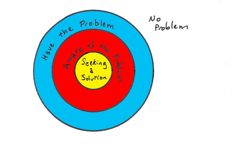
Or what if he said “Start with the people seeking a solution, then you can begin the journey to acquiring people who are at least aware of the problem, and finally you can figure out how to reach those who don’t even know they have the problem.”
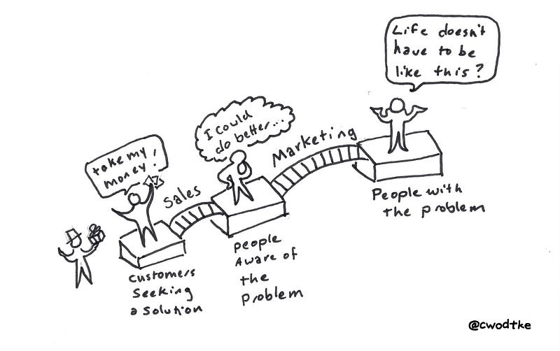
By trying out different metaphors in our drawings, we can refine our message.
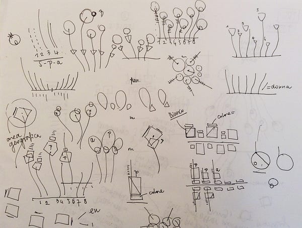
In Giorgia Lupi’s Sketching with Data Opens the Mind’s Eye, she talks about using drawing to explore different arrangements and metaphors for her data models.
Drawing is a primary form of understanding reality and expressing thoughts and ideas.
Drawing, in any practice, helps to freely navigate possibilities and to visually think without limitations and boundaries, it allows connections to be made, it opens mental spaces.
And drawing also helps you to discover something you probably don’t have in mind yet.
Building a Visual Vocabulary
When I first started to make models, I reached for whatever model I felt comfortable with. It means I made a lot of Venn diagrams and 2×2’s.
I was like a baby, using the only five words I knew. I had to increase my vocabulary in order to express myself clearly.
As with drawing, you need to build a visual vocabulary for yourself.
You can start by borrowing pre-existing vocabularies.
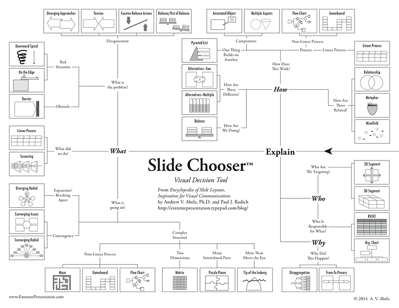
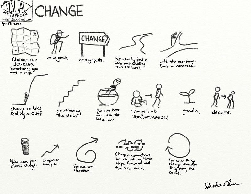
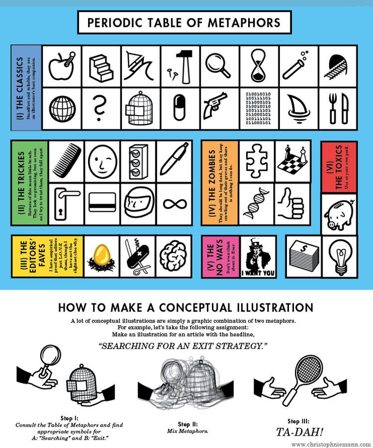
And you can collect examples you like, as Stephen P Anderson has here (his pinterest board has more things in it than mine does.)
Try sketching them into a notebook. When you write onto paper, you are also writing into your memory.
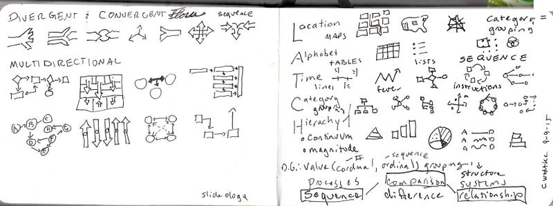
And don’t forget to be playful, to explore and to talk to yourself!
Why?
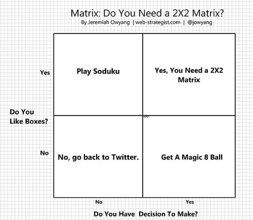
The payoff is clarity, efficiency, and on a good day, humor.

Addendum
I got the original steve blank reference from David J Bland, and boy was I off! But as I said, I wanted to demonstrate exploring metaphors, and that I did.
As an exercise, read Perfection by Subtraction and redraw his model. Post it in the replies, or tweet it to us… steve blank, David J Bland and Christina Wodtke

Practice makes Pictures!
Sign up to be alerted when Pencil Me In, my book on visual thinking, is available.
More on Visual Thinking
How to Make a Concept Model
Five Models for Making Sense of Complex Systems
Alphabets and Ideographs
Books on Drawing
More …