 A few years back I was obsessed with the question of why some companies rocked at one thing, and sucked at another. How could Amazon be so good at Information Architecture & Interaction Design, and yet so bad at Graphic Design (and Apple software the opposite: pretty and pretty unusable.) I mean, they could afford hire endless numbers of designers, right?
 Around the same time I was studying a lot of Game Design theory, and I came across MDA, a theory of how game design works. MDA is a theory about the emergent nature of game play. It says when you combine game MECHANICS (shoot something, collect coins, jump over something, open a locked door, etc) the combination becomes DYNAMICS (sidescroller, boss battle, etc) which then is experienced by a player as a type of fun, or AESTHETICS (Fellowship, Challenge, Fantasy etc.)
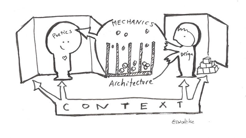
I also was reading up on Loops and Arcs, which are ways to organize game play. That’s when I realized MDA was missing architecture. Which led to asking what else was missing, trying to apply it to “mundane design” (the design of everyday things?) and tl;dr I came up with a theory for designing stuff I call CAMP. It’s an acronym.
Let’s walk through it.
Context
All designing should start with understanding the context in which the thing will be created and eventually exist.
 Where will it be experienced? By whom? What do those people already know? What is your budget? Your timeline? Who are you working with? What knowledge do you have access to? It’s a combination of generative research, requirements gathering and understanding constraints.
If you plan to give a talk, you ask “who is in the audience? How big is the room? Will I be mic’d? Is there a confidence monitor?” etc.
If you write a book, you ask, “Who is the reader? What is the genre? Are there expectations associated with that? Is it a short story, novella or a novel?” etc.
If you build software, you ask, “Who is this for? How do they solve this problem today? What other software do they use? How does it fit in their life?” as well as “What technology stack do we have? How much time do we have? Who is working on my team? How do we make money?” and so much more.
If you skip examining context, you will make the wrong thing for the wrong person, spend all your money, create something unbuildable and undesirable, and a host of other bad surprises.
Architecture
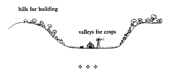
 All works should have an architecture, but not all do. By that, I mean a designed work should not be a jumbled heap of stuff, but be ordered via a conscious organizing principle: a framework.
Many organic works lack architecture, and end up rambling and confusing. A designed work without an architecture can be successful and there are plenty of examples out there. It’s like a bag of Bertie Bott’s Every Flavor Beans: it is mostly ok until you get earwax flavor when you thought it was butterscotch. Or perhaps more like the Winchester Mystery House, with doors to 50 foot drops and staircases to the ceiling. A hot mess can be briefly interesting, but they tend to collapse over time. MySpace, for example. Yahoo, Tumblr, The Davinci code, True Detective… (feel free to add your own.)
Stories and movies have plots. Games have arcs and loops. Software (including websites) should have concept models at least. Buildings have blueprints (reveals the architecture). Restaurants have menus (reveals the architecture, or lack thereof. Never eat anywhere that has chicken chow mein and chicken cordon blue on the same menu.) Presentations ought to have architecture more often than the do.
Complexity is made clear by well designed architecture.
Mechanics
Game Design is the only art form I know of that has a name for all the tiny strategies of play, so I’ve adopted it: mechanics.
In writing (and movies, tv and other narrative art forms), mechanics include

✤ foreshadowing
✤ metaphor
✤ repetition
✤ reversal
✤ dialogue
✤ theme
✤ setting
✤ semiotics
✤ juxtaposition
✤ characterization
✤ escalation
…and much more.
Mechanics are strategies for intellectual comprehension and emotional manipulation. (I’ll point out that emotional manipulation is desirable when reading a novel or watching a movie.) Mechanics are how a designer ensures their audience understands, acts and feels as the designer intends.
Mechanics can be as tiny as awarding a loyalty point, or bigger, like a leaderboard. Mechanics can be made by combining other mechanics. In Interaction Design, they are both microinteractions and macro. In presenting(or acting,) mechanics can be use of a prop, drawing on a whiteboard, and all the tools of story.
Mechanics are context-specific. The mechanics used by game designers and interaction designers overlap, but are not all the same. The mechanics used by novel writers and movie makers overlap, but are not all the same. Medium will suggest mechanics. For example:
Cinefix (above) is a study of film architecture and mechanics. Christopher Alexander’s A Pattern Language is an encyclopedia of mechanics, and the poetics they evoke.
Poetics
This is the experience the audience/user/customer has when they receive the designed work. In MDA it’s called aesthetics, but I changed it for a couple reasons. First, in MDA, people keep misinterpreting aesthetics are meaning look and feel. Look and feel choices are actually mechanics, i.e. strategies for creating emotion. Secondly, CAMP is a better acronym than CAMA.
The most important thing to understand about Poetics is that they do not exist until an end user (customer, player, audience) interacts with them. The maker may have an intention, but it is unknowable until the work is made public.
Digital products become experiences when people use them.
The term “Poetics” was adopted from a book that profoundly influenced me as a young writer: Bachelard’s Poetics of Space.
“Verticality is ensured by the polarity of cellar and attic, the marks of which are so deep that, in a way, they open up two very different perspectives for a phenomenology of the imagination. Indeed, it is possible, almost without commentary, to oppose the rationality of the roof to the irrationality of the cellar.A roof tells its raison d’etre right away: it gives mankind shelter from the rain and sun he fears. Geographers are constantly reminding us that, in every country, the slope of the roofs is one of the surest indications of the climate. We “understand” the slant of a roof. Even a dreamer dreams rationally; for him, a pointed roof averts rain clouds. Up near the roof all our thoughts are clear. In the attic it is a pleasure to see the bare rafters of the strong framework. Here we participate in the carpenter’s solid geometry.
As for the cellar, we shall no doubt find uses for it .. It will be rationalized and its conveniences enumerated. But it is first and foremost the dark entity of the house, the one that partakes of subterranean forces. When we dream there, we are in harmony with the irrationality of the depths.”
― Gaston Bachelard, The Poetics of Space
In other words, attics and cellars create very different emotions in us. Poetics describes the psychological state created by the choices made by the designer.
If you want to understand poetics for interaction design, look at apps. The app store ecosystem and price point has created a cambrian explosion of apps with the same core purpose and wildly different poetics.
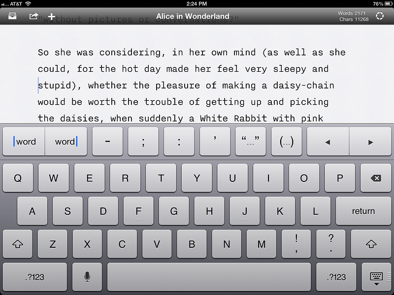
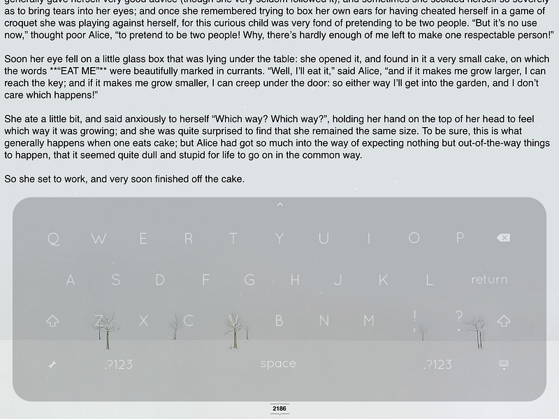
For example, a word processing app can evoke a variety of feelings depending on choices made in mechanics: feature set, graphic design choices, microinteractions. Both iAWriter and OMWriter discard Microsoft Word’s “all the features for everyone” approach in exchange for a stripped down writing application that creates a very different writing experience.
iA Writer “gives you the experience of disappearing into the text and forgetting everything around you.” It makes you feel like Jack Kerouac banging away on his Underwood. By choosing fewer features, they’ve created a poetics of simplicity and focus.
OmWriter also has a austere feature set, but it plays chimes and has a whimsical background of winter trees. It evokes diaries and morning pagesand the artist’s way.
No one loves Microsoft Word (that I’ve ever met) but both these apps have passionate fans.
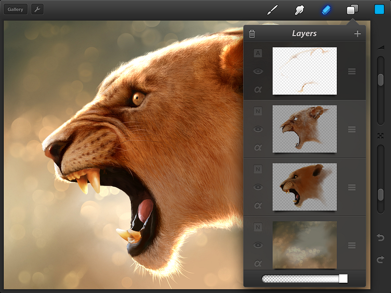
We see the same played out in drawing apps. ProCreate is Photoshop for the iPad. It has the poetics of utility, power and mastery.
Using CAMP
CAMP can be a diagnostic tool, as I had first intended. When student work is off, I can ask myself “what is broken here?” Incomplete understanding of context? Wrong context? Lack of architecture? Inharmonious mechanics? Not enough testing to assure the Poetics meet the intent?
But more and more I find myself turning to CAMP as I make my own work. I use CAMP when I design a class.
C: Who are the students? What do they already know? What are the learning goals? How long is the class? What room is the class held in? When is break?
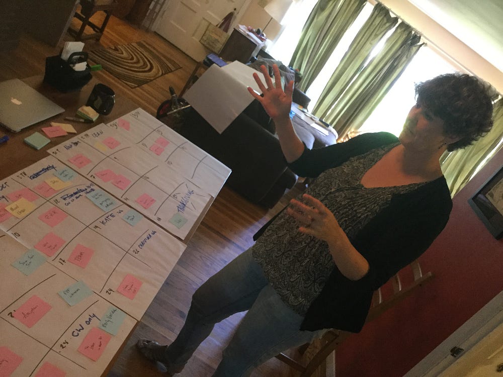
A: One long project, or many short, or a combination? Creative Founder is one long project (get to product market fit) while Foundations is three medium projects with two short “book ends.”
M: What books, videos, etc can I use? What exercises will we do in class? Will we sketchnote, do opening drawings, improv? Quizzes? Tests? Blogging? Guest lectures? Me lecture?
P: It’s funny to think of a class as having a Poetic, but it always does. Creative Founder is about finding your own strength in adversity. Story is about empathy and understanding. Foundations is about making this crazy evolving world make sense. By understanding context, then choosing the right architecture and mechanics, students can have an experience that will shape them for the rest of their lives.
Because Poetics is emergent, I need to check in with students to understand what’s working. I run regular “retrospectives,” where students can share what aspects of the class are successful and note what isn’t. We then propose experiments to make the class run better for everyone, and then check if those are working. Some classes are chatty, some prefer more studio time. Being the teacher doesn’t mean I have all the answers. It just means I’m in charge of finding them. I like to do that in collaboration with my students.
CAMP has been useful to me in all my endeavors, from writing to teaching to design. I hope it will help you make sense of your work too.
Afterword
Poetics could be replaced with Experience, which doesn’t mean quite the same thing, but is more every day and less fancy pants. It makes the acronym CAME. I’m not sure how I feel about that. Feel free to leave responses.