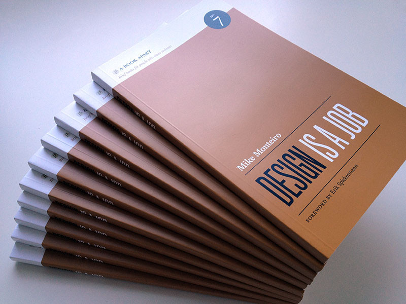
Design is a Job should be required reading for anyone making a living doing Design. I will write […]
Words on Wireframes
What’s Wrong with Wireframes?
After an extensive search, I find I have not written this down (at least in a blog– I have referenced it in talks.) Now, most of these points can be/have been addressed in one way or another. But one might ask yourself, what other deliverable is as criticized as wireframes, and could there be something better?
Firstly, wireframes emasculate the designer. Wireframes have often had a place in multi-disciplinary teams where the graphic designer had come from print, and didn’t really understand interface design. The interaction designer came from software and was making ugly terminal-esque interfaces. So in order to make sure the end result was palatable, the interaction designer (or information architect; I’ll use this term interchangeably in this post) would make a pig, and then the graphic designer would put lipstick on it. This was 1998.
But as designers got savvy to interface, they started resenting the restrictions on their ability to creating compelling and useful designs. After all, a designers toolkit is essentially font, color and layout. The web browser stole the first, if the IxD steals the third they are relegated to the sorry position of kid with crayons handed a coloring book. Think hard of the last wireframe you saw. Didn’t it look a lot like a paint-by-number, with only the numbers missing?

