Originally published in The Journal of Information Architecture
The joy of the city is its diversity. A great city has styles of buildings from many eras. It has architectural successes and failures. It sports buildings that have been adapted over the years, learning from each new tenant. And in the city’s corners are magnificent follies, built to please some visionary individual with the capital to make dreams real. The city citizens move from distaste to begrudging acceptance to rabid protectiveness of their many unique buildings.
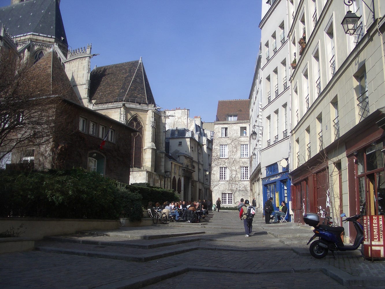
In a great city you sense the wide variety of people who live and work there reflected in the styles of the buildings and plazas they inhabit. Bangkok seems to exist in three centuries simultaneously: when the skytrain doors open you could be facing a talking billboard or a colonial townhouse, a modern mall or a Golden Wat. Even Paris, which we think of as endless rows of Beaux Arts townhouses, both embraces modernist skyscrapers and treasures its medieval corners.

But there was a time when quirky Paris was under siege. Between the world wars, Modern Architecture was more than a movement. It was a moral stance. It demanded an end of decoration and focus on functional design. In 1925, its leading figure, Le Corbusier, railed to tear down downtown Paris in order to save it. His Plan Voisin outlined a vision to clear much of the 4th and 5th arrondissements of their inefficient townhouses and meandering streets and replace them with dense “machines for living in.” At the time, the area he wished to modernize was overcrowded and disease-ridden. It seemed easier to redesign than rehabilitate. Today, gentrification has made the once squalid Marais one of the prettiest parts of Paris, with winding streets full of cafes and architectural history. It’s worth taking a second to consider what it would have been like to drink an espresso under the skyscrapers of his plan.
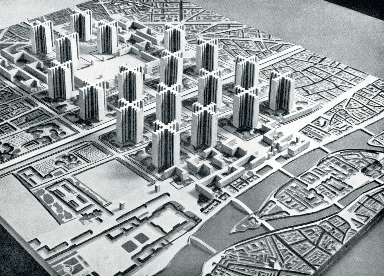
Modernist architects were horrified by the filth and inefficient squalor of medieval cities and sought to clean up the cities. Unfortunately that would have meant an updating of aesthetics as well as plumbing.
Modernism Comes to the Web
The current state of digital design resembles the height of the Modern movement in architecture. Many modern designers see the crazed tangle of the internet with its porn and captioned kittens as noisome squalor, equally in need of reform. Steve Jobs at Apple was a Le Corbusier, enforcing strict aesthetic parameters on both his products and those created by others for his platform. Jobs is oft quoted saying “people don’t know what they want until you show it to them.” He left behind a legacy of “the designer is always right.” Cities can resist change, but users of software have no recourse to review or approve major renewal efforts. Apple cheerfully razed 6 years of design convention, imposing a new set of behaviors and a new look and feel upon an city-sized population of developers and customers, literally overnight.
Today’s software platforms are cities made of information. Users spend as many waking hours in these digital cities as they spend in their concrete ones. So why do today’s crop of designers feel like they can impose urban renewal on the citizens of these platforms without so much as a hearing of grievances?
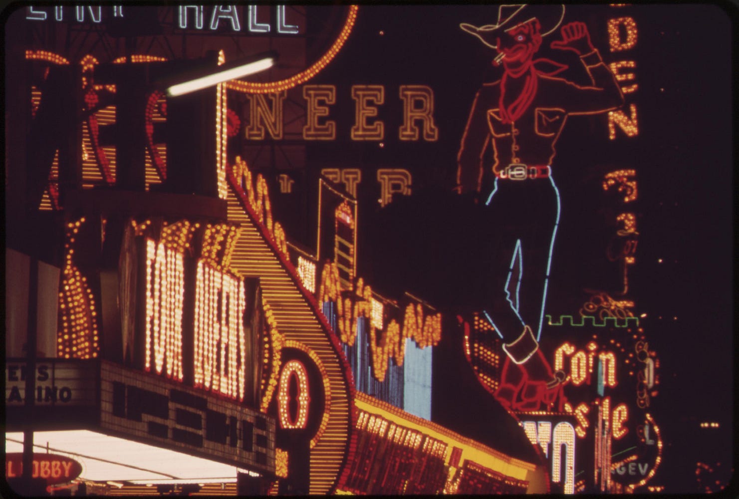
“Architects are out of the habit of looking nonjudgmentally at the environment, because orthodox Modern architecture is progressive, if not revolutionary, utopian, and puristic; it is dissatisfied with existing conditions.” Learning from Las Vegas
Modern digital designers are out of the habit of looking nonjudgmentally at digital products. To put it more simply: these designers judge designs as bad or good rather than seek to understand why each decision was made. They are most judgmental when those products are not designed by designers, but by execs, engineers or, worse of all, the users themselves. The hall of shame stretches from Geocities through Myspace to the semi-restrained Tumblr. But surely Myspace around 2007 was the Las Vegas of the internet; garish, inexplicably popular and abhorrent to designers. It has, like its sister city, been utterly remade more than once, but its name still stands for what is worst in popular taste.
Nonjudgement
When Denise Scott Brown took a dozen Yale Architecture students and her husband Robert Venturi to the Las Vegas strip in 1964, Modernism was king. Modern architecture abhorred decoration. It deified the functional. Its favored building materials were concrete and steel, unembellished.
Las Vegas was the opposite (except, perhaps, in its shared love of concrete.) In Vegas, style trumped substance every time. Although there were no pirate ships or dancing fountains yet, the strip was a wall of blinking signs, giant donuts and expansive parking lots.
Venturi and Scott Brown went to Vegas to find the antidote to modernism’s cry of “Less is more.” They found it. The two architects treated Vegas with the seriousness afforded a cathedral. They examined the effectiveness of billboards and pondered the building-as-sculpture.

They developed theories about spaces that humans shopped in, played in and drove 60 MPH through. They studied spaces ordinary humans loved rather than venerated. Rather than judging the choices Las Vegas architects made, they tried to understand why they worked for Las Vegas denizens. From those observations, they developed a theory of architecture that was about large gestures, bold symbols and a disregard of the icons of architecture. When they were done, they pronounced “less is a bore” and postmodernism had a manifesto.
Unsurprisingly, this veneration of Las Vegas excess created some controversy upon publication, but the book is considered cannon today. Somewhere between billboards and giant donuts, architects spotted potential for play.
Less is a bore
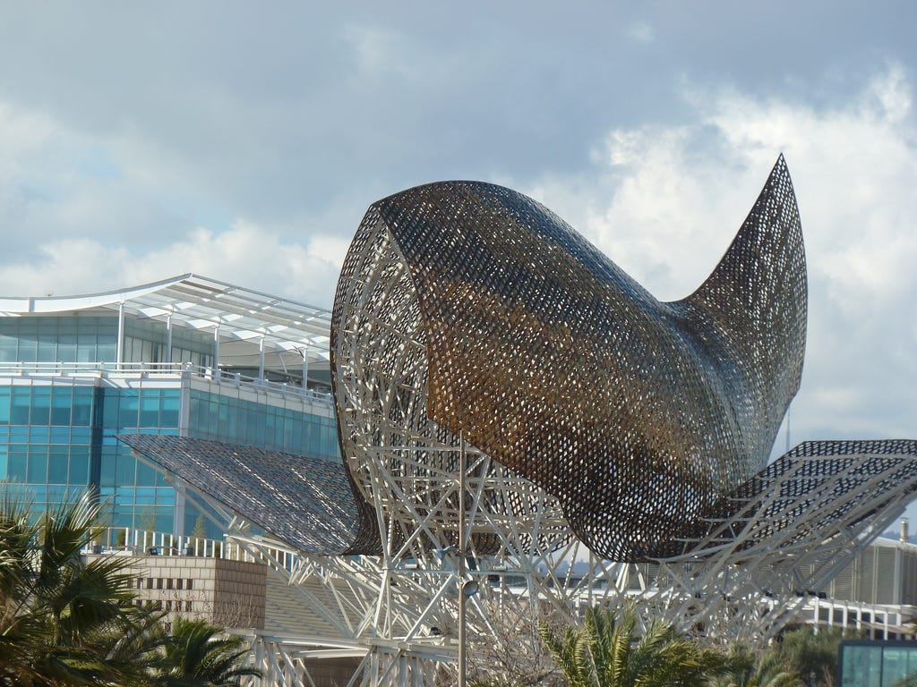
The postmodernist movement boomed, and there was a return to buildings full of “wit, ornament and reference.” Rem Koolhaas and Frank Gehry have given us magnificent ducks (buildings as sculptures) and revitalized cities result. Gehry’s Guggenheim in Bilbao, Spain pulls in the tourists as effectively as the Luxor pyramid does in Vegas.
So what?
What does that mean for the designers laboring in the bowels of Facebook, waiting for Zuk to swing by? What does a inhabitable fish mean to the designer tweaking a search results page at Google?
Spend less time looking at Apple and more time on IMGUR.

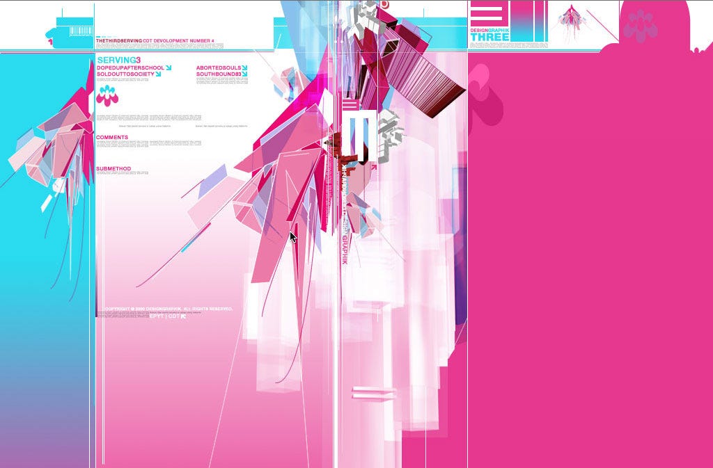
Over and over again we’ve seen massive popularity of sites that make our eyes water. Geocities and Myspace gave their site creators tools to use color, font, sound and images how they saw fit. Myspace was perhaps the most aptly named. Because users could access the underlying code and make their profile be anything they wanted, even if it meant it was no longer parse-able by modern browsers, they saw it as their house in digital space. It was the one place on the internet where your site met your standards of beauty, not someone else’s. The Myspace users were passionate and proselytizing. I can remember the first time I saw Myspace. A front end developer grabbed me by the arm and said “Boss, you have to see this. You can do anything you want here.” And he would not leave until I had sat down and started my own page.
The passion for Myspace was not just the endowment effect; it was the pleasure of spending time with communities of people who shared the same interests and the same taste; a taste that wasn’t always that of the design elite. Myspace was made of groups of people who cared more about having fun than being aesthetically correct.
Eventually Myspace collapsed: over-commercialized, abusive of its usersbase and overrun by spammers. But it wasn’t a lack of taste that killed it, no matter what the people who give out awards want you to believe. Myspace looked just like what the Myspace users wanted it to. Like Las Vegas, it was delightfully garish. And if we respect that a new idea can come from anywhere, can we learn from Myspace? Could we find our way to the internet’s answer to the Bilbao Guggenheim by way of Myspace?
Suddenly, we have populist sites that give their customers self-expression with training wheels. Tumblr’s theme garden lets you try on interface fashions as you would dresses at Anthropology. You can express yourself without killing someones browser or interfering their their download speed.
Many of the homes for the most passionate communities are those that will never get Jony Ives’ blessing: Deviant Art’s defiantly minty site is full of big eyed pones and cosplay chronicles; Reddit uses tiny tiny tiny fonts in a time when bigger is sexier; Hacker News seems to have skipped design fashion entirely. But to think these sites don’t have any design is to miss the point entirely: they are all designed. They are designed to someone else’s taste, not the Flat mafia. They are not Steve’s children, and they aren’t going to update their look and feel because of anything coming out of the Cupertino Campus.

Some people live in Miami, some people choose San Francisco, some choose Chicago; each city has its own flavor and makes room for the variety of quirks its citizens posses. Thus are these platforms, consistent in each’s idea of what a platform should look like and work, yet setting up flagpoles for each citizen’s freak flag to fly.
Make Different
The entire internet should not be a sea of parallax-scrolling Helvetica/Georgia-fonted whitespace and giant photo sites. The internet is wonderful because of its diversity in styles as well as opinions. Back in the first internet boom, a book came out that I treasured: Fresh Styles for Web Designers. I did not like all the styles that were showcased. In fact, I didn’t like most of them. But it celebrated an aesthetic of individual expression over slavish adherence to a single standard. I reveled in possibility of an internet that looks like the buildings on the streets on San Francisco and the faces on its buses. I celebrate a human internet.
Every Facebook profile looks the same and all the apps on my iphone do too. I want to be shocked, teased, challenged. I want my museums to have giant fish swimming above them and I want websites full of memes. But! I also celebrate Medium’s restraint and Modernism’s sense of space. I prefer a world in which there are many ways, not one way. This is the way of the city. This should be the way of the platform.
“Cities have the capability of providing something for everybody, only because, and only when, they are created by everybody.” ― Jane Jacobs, The Death and Life of Great American Cities
Today, every architect is taught the importance of site on which they will place a building. They learn to consider not just the landscape, but the other buildings around the site and the culture of the people of the city. Today’s digital designers need to develop that same respect. They must learn to fall in love with and be inspired by the culture of the citizens of a software platform. To recognize their own aesthetics are just as personal and peculiar as their users. Designers must look non-judgmentally at the environment in which they are designing.
Finally, I’d like to make a plea to those few designers who have been given the power to redesign entire platforms: consider Robert Moses, who almost ran freeways through Manhattan and would have destroyed the West Village. Consider Baron Haussman, who did run boulevards through Paris, razing many medieval warrens to the ground. Consider Le Courbusier’s Plan Voisin. Think not just twice, but three times, before you rip out those skeumorphic eyesores and labyrinthine navigation systems. Are you sure your platform’s citizens will thank you?