While Design Thinking gets all the attention, it is not the same as (Digital) Product Design.
In How I Stopped Worrying and Learned to Love Design Thinking, I wrote about how I learned to value design thinking and in Five Habits of Design Thinking I explain how you can build the skill of design thinking. But I’ve noticed my students tend to use the term “design thinking” as a synonym for UX/Digital Product Design. This is a dangerous smallification of design and a source of shoddy work.
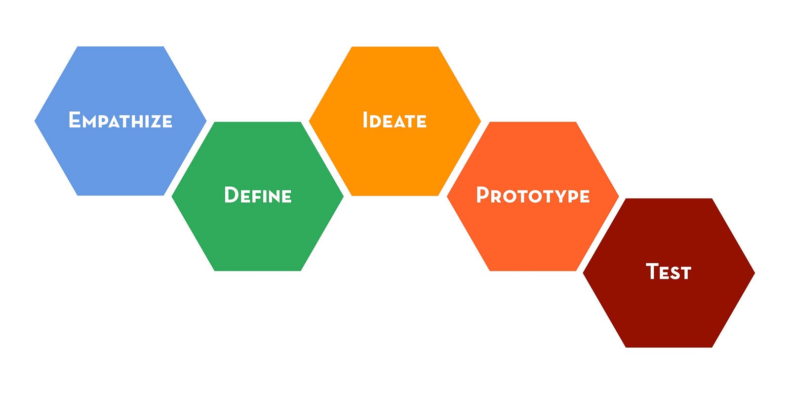
This is not the complete design process.
Laura Klein explains the depth of complexity of design by taking you through one example of a feature: a reporting flag. You put a simple comments feature on a children’s book seller site, and immediately you get spam. So you put up a reporting flag. What does it do? Does it remove the comment? What if people report comments they just disagree with, but aren’t offensive? Should go to someone in the company, or can you use an algorithm? What if there are hundreds of reports a day? Are you going to hire more people? Does it take three reports to disappear the offensive comment? Or something logarithmic? Do you build a tool to block certain spammers? Do you implement Akismet? How transparent are you about what gets you banned? How do you handle people who say their comment was a reasonable critique, even if someone else found it offensive?
All features have consequences. Complexity is exponential. If complexity is not accounted for in the design, unforeseen consequences can kill a product. Design thinking is great for approaching problems in a new way and coming up with opportunities for improvement, but does not address the complexity of designing a product that is launch ready.
While many attribute design thinking to IDEO, they themselves admit they didn’t invent the term, just ran with it. AND that there is more to design than design thinking.
“ IDEO is often credited with inventing the term “design thinking” and its practice. In fact, design thinking has deep roots in a global conversation that has been unfolding for decades. At IDEO, we’ve been practicing human-centered design since our beginning in 1978, and took up the phrase “design thinking” to describe the elements of the practice we found most learnable and teachable — empathy, optimism, iteration, creative confidence, experimentation, and an embrace of ambiguity and failure.” IDEO, emphasis mine.
Design Thinking’s popularly has led to the below statement.
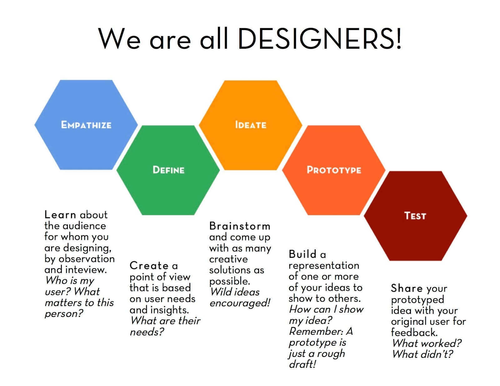
Let me take a stab at the elephant in the room: we all design, but we are not all designers. We all cook, but we are not all chefs. We all take photographs, we are not all photographers. We all draw (you really do, even if it’s only lines on a whiteboard while you complain about your drawing skills) but we are not all illustrators. To design well, you must study a number of topics, all worthy of a life time of practice, from graphic design to ergonomics. It is human to design, but it is a profession to be a designer.
That’s what is missing in that diagram: the craft of being a designer. Let’s fix that by fleshing out a few hexes….
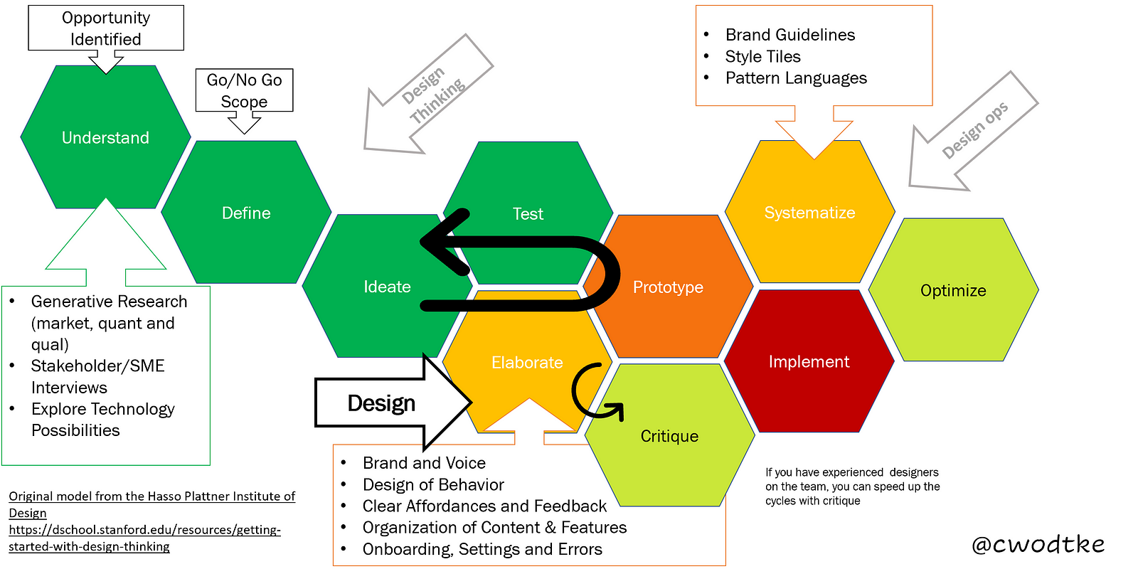
Change 1. from Problems to Opportunities
While the diagram itself doesn’t state that “design is problem solving” most of the material surrounding it does. Instead of problem, I start with opportunity. Problem is problematic because not everything is a problem. Opportunity is pretty awesome because it encompasses both problems and good things that could be better/different/cheaper (classic differentiation strategy.)
Change 2. UNDERSTAND replaces empathy for so many reasons. Empathy suggests that all you need to design well is to research the end users and really feel their pain. But it’s not just the end-user who informs design but so many more factors, including buyers, teammates, tech and funding. Understand the Context is a more accurate term, IMO. While I’ve written a little bit about context , even to attempting a canvas for it, context is always highly variable depending on the situation. Yes, people, IT DEPENDS.
That said, you always have to UNDERSTAND at least these three elements.
- The Target Market (users, humans, doctors, designers, cats)
** Their mental models
** Their behavior
** Their environment
** Their capabilities
** and more.
I haven’t even gotten into the buyer/user dichotomy. - The Technology available
** What is already built that you can leverage
** What capabilities does your team and company have
** Can we just assume there is always more? - The Business Model & Funding strategy.
** What resources (people and money)) do you have and for how long?
** What business model is it? Subscriptions, direct sales, B2B, in-app purchases — all these and more will directly affect design choices.
Change 3. Define. I have mixed feelings here, as “define” doesn’t stand alone very well, but it is not inaccurate. At some point after you understand the context, you can make a draft definition of the opportunity, usually in the form of a value proposition.
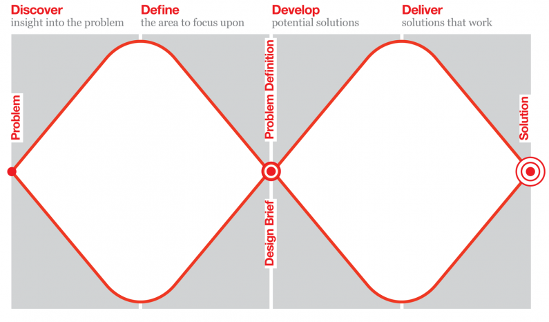
Another popular model, the double diamond, points out two key define moments: The opportunity (problem) and the proposed solution. It emphasizes you must go wide to do well in both.
I am a big fan of exit criteria over deadlines. John Cutler gives this example

We don’t often say, “this is not worth doing”even when we should. So I added in Go/NoGo as well as Scope to the “define” phase. In the context phase, we learn a lot about the situation and can say, “this is the opportunity we are going to address in this phase. Not that opportunity over there and not that other situation. Only this.”
Change 4: it’s a loop. Because you stay into the loop until you have something worth shipping. Sometimes you even go all the way back to understand because the more you make stuff, the more you realize you the holes in your knowledge. Loopy loop loop. Not waterfall.

Change 5. Added critique. Critique is when designers share their goals for a design and their strategy for achieving it. Then other designer give advice how to get you closer to that goal. Senior designers have the experience to find issues and suggest solutions without testing.
You can spin though the Build → Measure→ Learn cycle a hundred times and still not have a viable product, but if you have a senior designer on board, you can cut that in half (or further) because a senior designer can spot issues in usability that might lead to false negatives (I have seen this many times.)
Don’t have a senior designer? Have everybody look at the early work and leave comments, questions and issues. Hang the work on the wall and have folks write on post-its any of their concerns. It’s a bit like open source: many eyes catch more bugs than one.
But you still have to test, because everyone has blindspots.
Let’s Get Elaborate
Change 6. This is the big one, the true heavy lifting of design doing: Elaborate.
Once you have figured out what the right problem is and what the right solution is, you have to flesh it out. This is hard and important work.
<Addition made 6/13/2020>
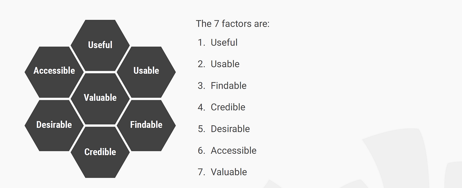
The Interaction Design Institute’s Hex Diagram lays out key goals to good software (what is it about hexes, people! Form should follow function, not the other way around???) This is really quite useful.
</Addition>
We then get to translate these target values to actual tasks performed by design.
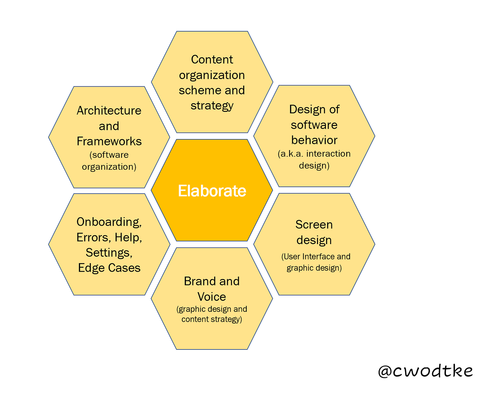
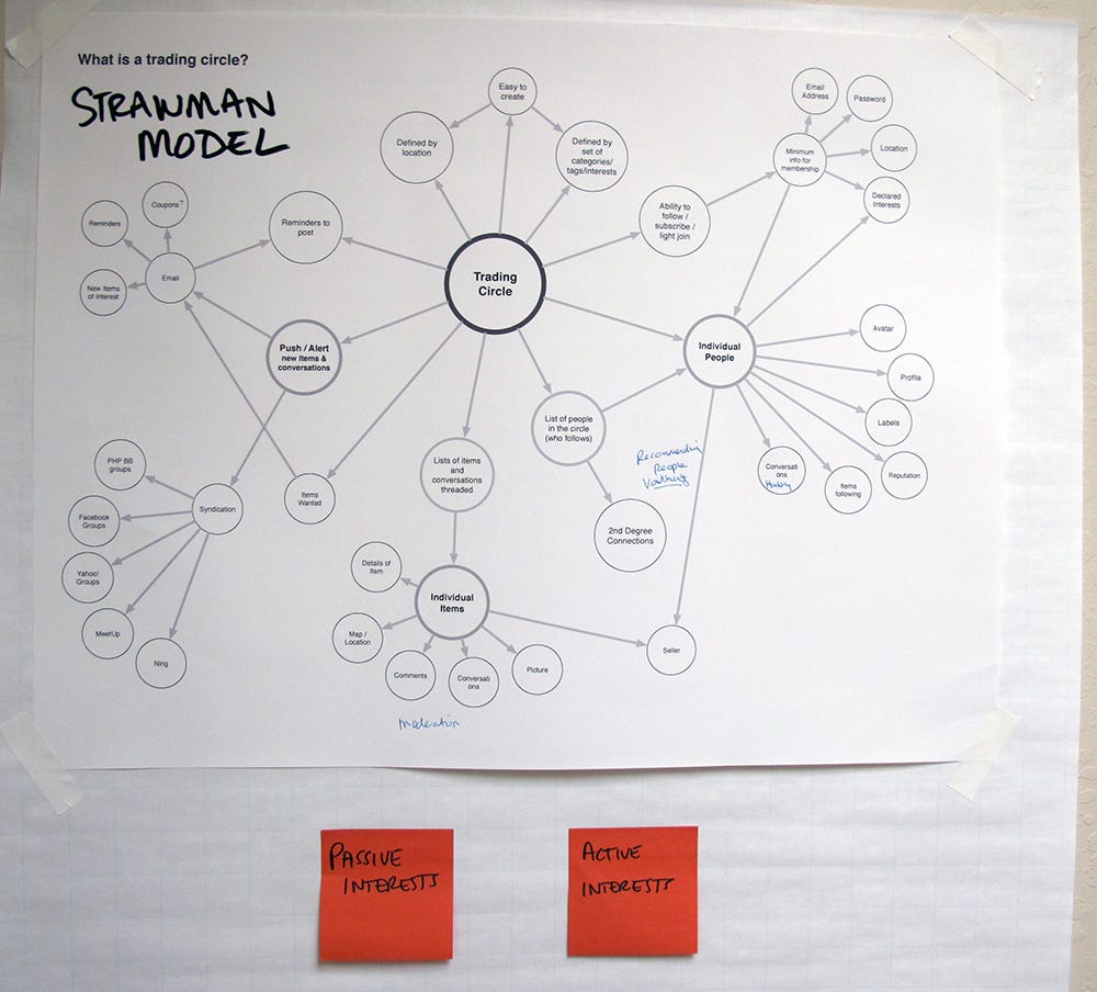
- Architecture and frameworks: This is how the software is organized. Will there be a settings area? Where does the “help” area go? Is the interaction modal or concurrent? And many more questions beyond your brilliant initial idea:“jobs4pets!”
Architecture is critical for the team as well as for the end users. It helps manage scope and make sure all the work, not just the fun thinking part, gets done.
For users it gives them a mental model of what is possible in the software and how to find it.
Frameworks are usually a bit more micro. They include decisions about whether to use a wizard or a toolbar/canvas model for interactivity. Take photo enhancing. On the large screen of a desktop you’d use a tool/bar canvas framework. But on a kiosk with novice users you’d use a wizard to guide them through removing red eye and cropping. Understanding context changes everything, and the designer must know both that and how to respond to a given context.
- Beyond the architecture, you need to organize the content and features.
Every instance of software, from apps to sites, has content. Some software has preexisting content. Some just have help sections. If you want to support retrieval and recommendations, you have to design for it. No, search is not enough.
Some software has user-generated content, which means you have to design the empty state that exists to convince users to add content, and once you have content how do you organize the unknown and mange it. Governance systems must be designed.
Tool software has its own unique challenges. When they are simple you have to design tutorials and help. When they become complex, (think Photoshop) someone has to consciously choose what functionality goes where so you can use the software without breaking flow.
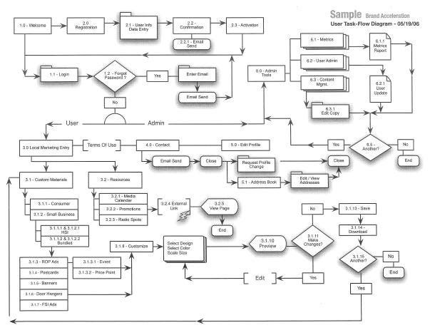
- Design how the software will behave (usually called Interaction Design, but done by more than just Interaction Designers.)
I’m not talking about making the people behave, I’m talking about designing how the software behaves (though one leads to the other.) What happens when you click a button. What happens when you don’t have any user-generated content? What happens when users report an violation of the TOS? What if they want to change their display name? How about their username? So many fiddly little decisions. Those fiddly decisions make software delightful or rage-inducing. - Interface/UI. I know, I know people use all these terms to mean so many things. Let’s pretend interface only means what is presented to the user so they know what is possible and how to do it. Radio button or checkbox? Carousel? Thumbnails? How do we represent hyperlinks?
It’s more than just designing flat screens though. Consider the rise of VUI, VR, AR and haptic interfaces.
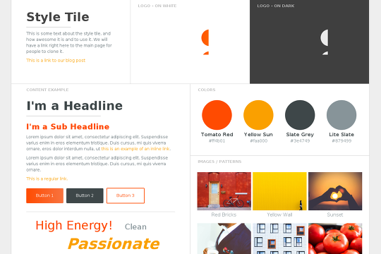
- Brand and voice. This is a mix of interface, graphic design, content strategy, writing… How do we represent the personality of the site? Silly error messages, or straightforward? What is the navigation language? How do we balance usable and on-brand? What kind of content do we allow? How is the logo managed? What colors can we use (and will they make sense for the color-blind?)
So. Many. Questions.
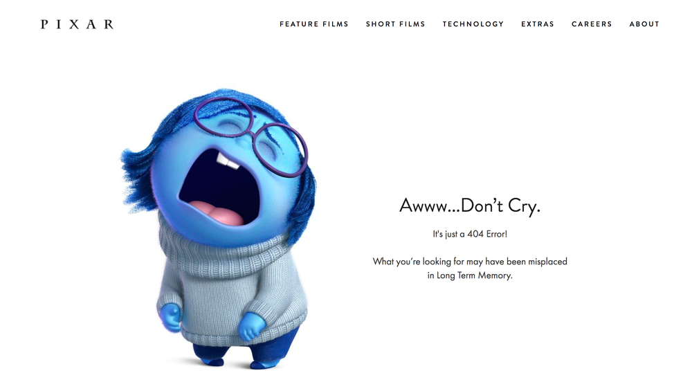
- And finally, the stuff that everyone forgets and is often designed by a PM and engineer at 3 am: error messages, 404s, settings, What is written in place of user generated content when you haven’t got users yet? Help sections.
OMG help needs design help STAT!
Onboarding is starting to get attention, but not always. Sometimes it’s slap dash, with an overlay, sometimes it’s a tutorial, and sometimes it’s a weird love child of both. Someone has to figure out both what strategy to take and how to realize it in the design.
THIS IS NOT EVERYTHING. This is a braindump from what I can recall shaped into six items because hexes. When I explained this to students, it looked more like this:
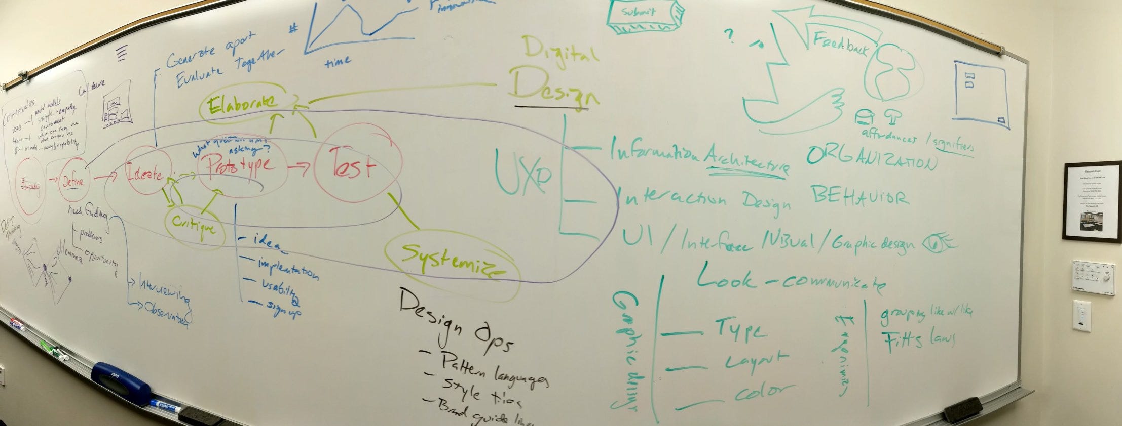
I tried not to name titles of who typically owns what. Sometimes in a startup the product manager, the front-end engineer and the one lone designer own all aspects of design. In a bigger company you get to have specialists who are really good at certain sorts of design, like Information Architects (architecture, organization, interface) or Interaction Designers (frameworks, software behavior design and interface) or Content Strategists (organization and brand/voice.) The field of digital design is very young and the titles are fluid. But what has to be done isn’t. If you don’t have expertise in these areas, mistakes will happen. Mistakes can be pricey.
It’s not enough to do design thinking, you’ve got to do design execution.
The original model used color haphazardly. Here I coded team (product, engineering, design) in green, design in yellow and programming in red. Mixes represent shared effort. As you can see, design thinking is something an entire team can do, but design doing should be done by a trained designer.
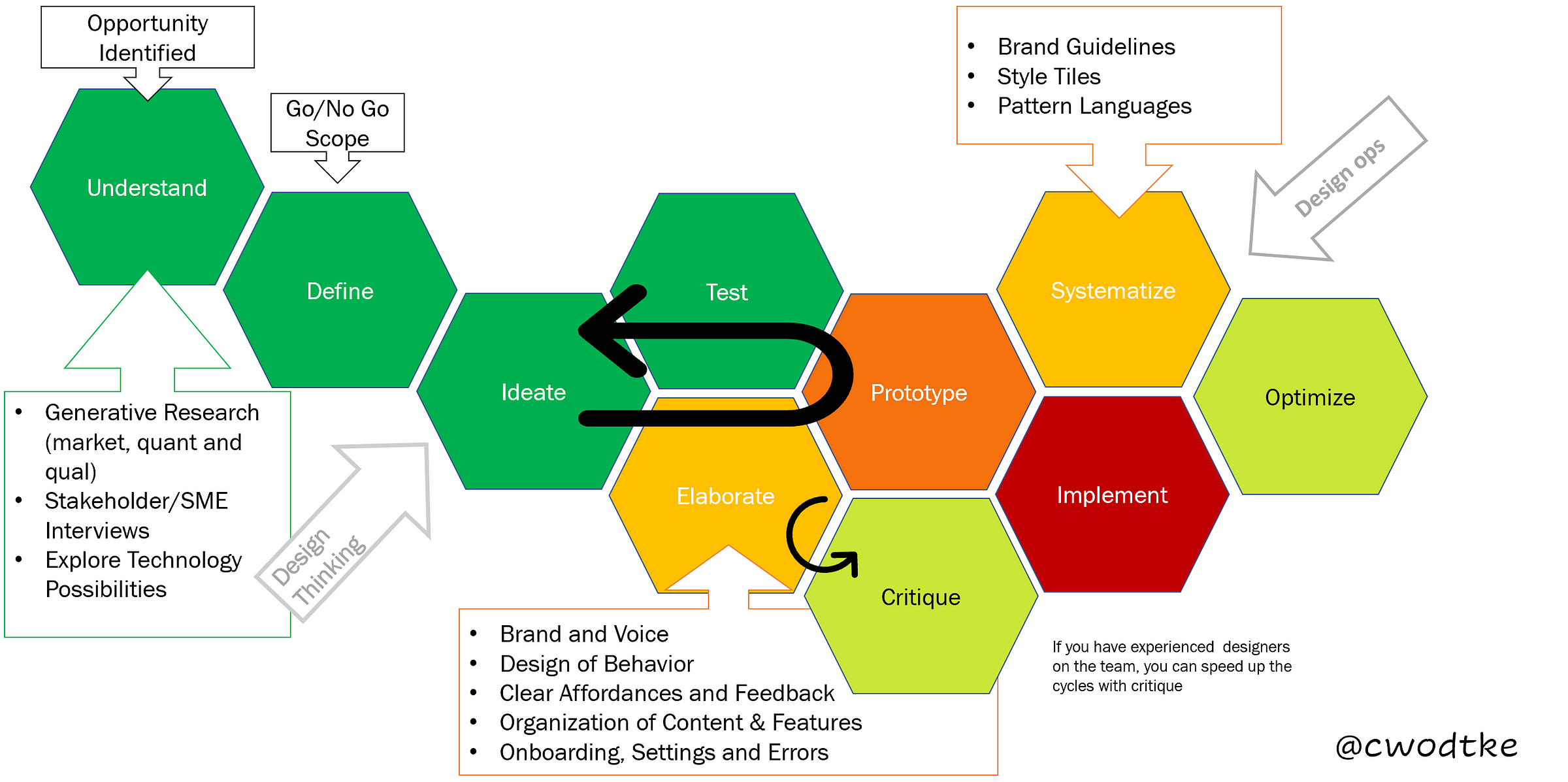
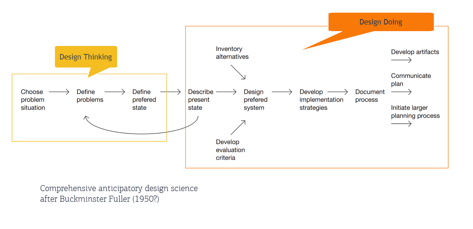
Design thinking is just an approach to getting a handle on wicked problems. Design is all about executing that approach effectively. Designers often refer to these two elements as finding the “right design” and “designing right.” Design thinking is an approach to the first item but design is much more.
After the Design Is Over, It’s Not Over
But wait! There’s more! As more designers move in house, rather than consult, we’ve seen the rise of a new design effort: DesignOps.
Read DesignOps 101 if you wish to learn more in detail. But for now, look at all this:
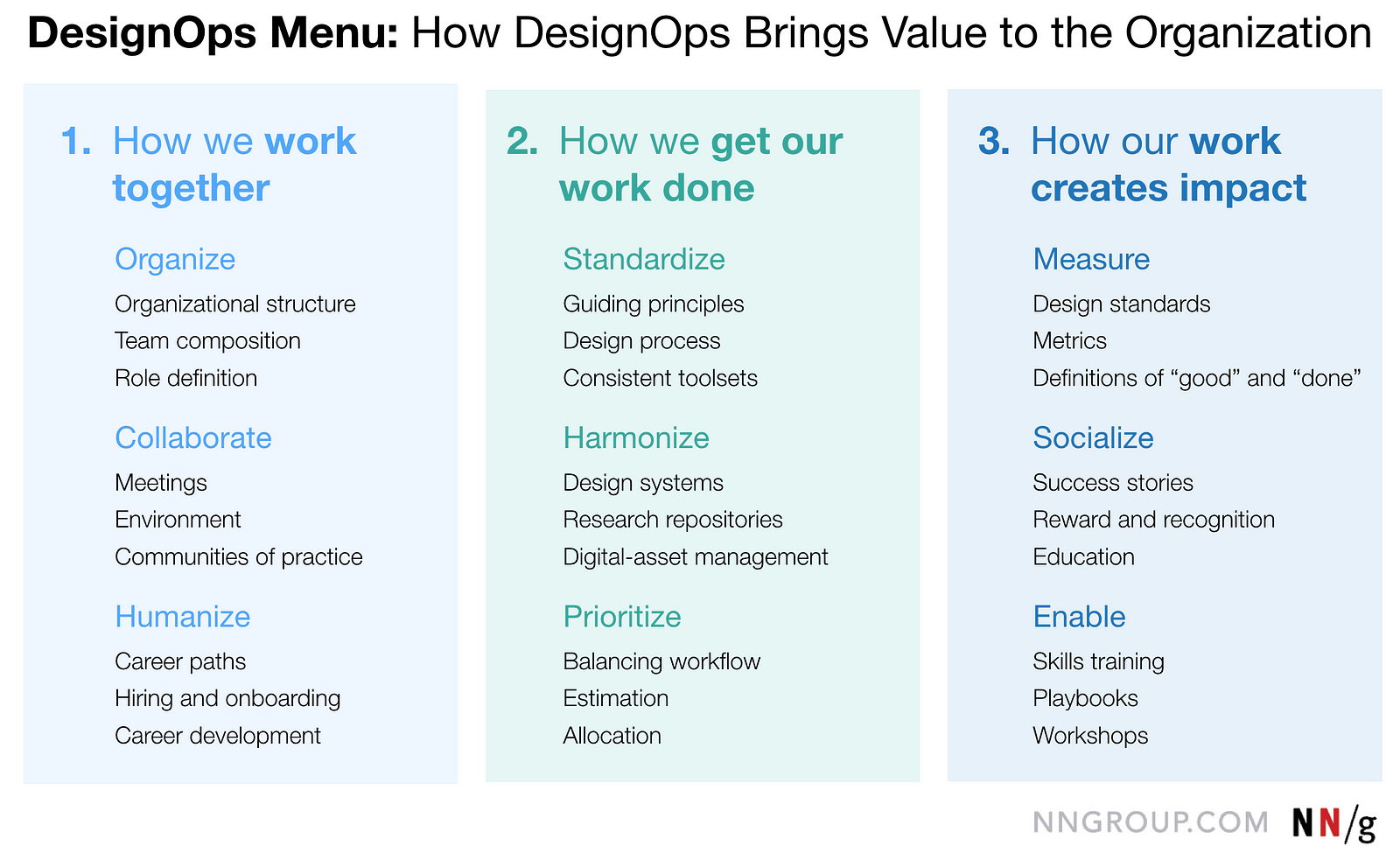
Thus the last two changes land more-or-less in Design Ops.
Change 7: add Systematize.
Once you’ve designed, you don’t want to reinvent the wheel. Design can codify design decisions so that nondesigners, new designers and even they themselves can make sure new work fits with the old work.
- Design patterns codify organization, behavior design and interface design to ensure usability. This means that you don’t have to do the whole understand-ideate-prototype-test etc every time you want to add some functionality that already exists elsewhere. Need a signin/login? it’s been figured out. Need a way to browse SKUs? It’s been figured out. And when you invent something new that’s been tested successful, you can create a new pattern to accelerate the rest of the company.
- Style Tiles and Style Guides make sure the right colors, logos, type and more are used when designers (and others) make new content and functionality. Nothing says “we’re amateurs and don’t give us your money” like having five different reds used. Even if the end user doesn’t know why, the entire software will look vaguely off, undermining trust.
Change 8: Optimization.
Design and product management often partner on the long and sometimes boring job of making everything get slightly better all the time.
Conclusion?
I decided to use the dschool hexes because they have gotten so much visibility, I hoped they’d be familiar to people. I could (and have) talked endlessly about the problems and power of models. All maps and models are useful lies, in that they edit and distort in order to simplify and create clarity.
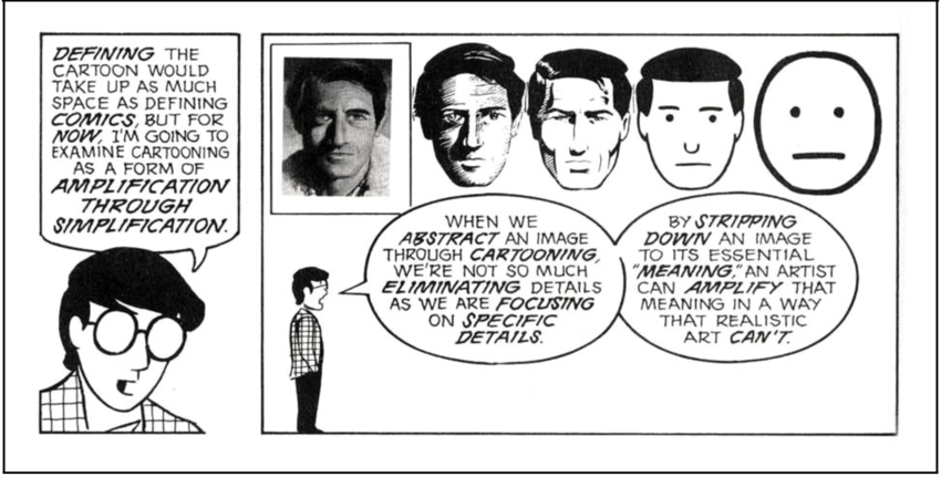
The dschool model is not the worst model, but it’s far from the best. There are a lot of models of the design process. Bruce Archer’s has 229 elements.
We simplify our models to communicate the big picture. But just because you see a forest doesn’t mean there aren’t a whole lotta trees down there. Maybe it’s time we help people see them.
❦ ❦ ❦ ❦ ❦ ❦ ❦ ❦ ❦ ❦ ❦ ❦ ❦ ❦ ❦ ❦ ❦ ❦ ❦ ❦ ❦ ❦ ❦ ❦ ❦ ❦ ❦ ❦ ❦ ❦
Twitter Thread that proceeded this (with many draft models.)