When I first read Malcolm Gladwell’s Ketchup Conundrum in 2004, I knew it was important to the work I do. I just didn’t know why until ten years later, when Apple’s itunes store changed the nature of how we design every day apps forever.
In Gladwell’s excellent article, he recounts how food scientists discovered that some foods, like ketchup or cola, seem to have a singular winning “design”. This ultimate taste is typically based on an exact and balanced mix of the five tastes our tongues can perceive. Yet in other food categories, like mustard and spaghetti sauce, preferences vary widely. There is no perfect spaghetti sauce, just the sauce you like. That means that in categories where there is no ultimate recipe, a single company, say Ragu, is better off offering a variety of products that match the variety of tastes, in order to compete with themselves rather than other companies. Software companies have been acting like digital products are ketchup. But are they?
Digital is a very young product category compared to food. So far consumers deciding on an email client choose between gmail’s search-centered approach or Outlook’s corporate desktop model. They pick between composing in Word, Google docs or maybe a blogging tool. Each company has picked how they would do each product, then moved to the next product to do that way; Google, a search company, made a searchy email. Linkedin’s search is social. But when Apple forced app makers to keep their prices low, something interesting happened to consumer’s choices.

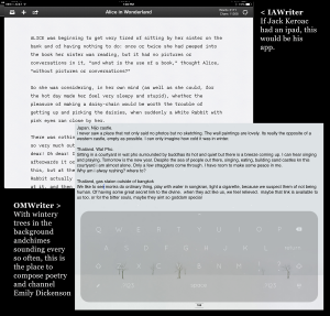
Consumers could now afford to have two or three drawing apps and two or three writing apps. You can have an app for when you want to be Cezanne out in the fields (Paper, by 53) or when you want to be a high-tech graphic designer (Procreate). Want to be Hemingway? IAWriter. Want to do your morning pages? Try Omwriter. It’s clear that some activities, like writing and drawing, require a variety of interfaces, moods and designs to match the variety of ways people write and draw.
In a critical paper on game design theory, Robin Hunicke, Marc LeBlanc and Robert Zubek wrote that there were 8 kinds of fun– sensation, fellowship, fantasy, discovery, narrative, expression, challenge and submission. These means it is possible to make a vast variety of games for people who want anything from the pleasure and terror of skiing down the slopes of Mordor (sensation and fantasy) to tilling the fields of Farmville (submission and fellowship). How boring the world would be if all games were solitaire and tetris, shipped with each new PC. And that is the state of our digital tools, for the most part. Until recently.
Let’s say there are 8 kinds of aesthetics for service applications — in another essay I’m crafting, I suggest utility, artistry, repose, acquisitiveness, fellowship, squalor, nostalgia, edification. With more aesthetics to pull on, we can make as many programs as there are ways for people to do the things they dream of doing. What if we made an email that was all about nostalgic squalor, or a to-do list about fellowship and expression?

In Doomed to Repeat It, Paul Ford wonders why we keep reinventing email and to do list applications. He suggests it might be because of changing culture. He writes, “People make email clients or to-do list apps in the same way that theater companies perform Shakespeare plays in modern dress. “Email” is our Hamlet. “To-do apps” are our Tempest.”
Shifting fashion does affect what we want from our application’s look and feel, but I think there is a more likely reason we keep reinventing the applications that are so critical to our everyday lives. It’s because no application truly fits anyone, no more than “one size fits all” clothes do. And if you are a tailor, and you don’t like the fit of your clothing, you make your own. Most startups come from trying to make an application that actually fits their life, and if they are lucky, it fits a whole bunch of other lives as well.
Which brings me back to spaghetti sauces. Why should a company like Google have only one email client? Arguably if they had several email clients serving different aesthetic needs, they’d be better positioned to own a large chunk of the market. If they buy email startups, is it really a good idea to shut them down and fold them into the master program? That will merely alienate the current user base. Amazon has been smarter than that with Zappos. The Zappos experience allows people who don’t care for Amazon’s search and recommend and prefer a more Nordstrom’s-like experience to keep giving their money to Amazon. Amazon gets richer, users stay happy, Zappos redesigns downtown Las Vegas. Win-in-win.
Companies often struggle when they try to take their point of view into a new space. Google struggles with social as Facebook struggles with search. But why do they bother? Why, instead of trying to search-ifying every digital product category, shouldn’t Google expand their offering in the category they understand? Why provide search not just for shopping, but for all the kinds of shoppers: optimizers, satisficers, safety-seekers and high-touch shoppers. Why not make image search for graphic artists, school children and yes, even people looking for nekkid pictures? And those narrow categories don’t have to huge user bases, they just have to offer enough to satisfy the variety of tastes searcher enjoy. You don’t need to own every aspect of a user’s life, instead own one aspect of everybody’s life.

Recently Medium radically changed their composing and editing interface. This enraged some users (myself included. That’s why you aren’t reading this on Medium). If Medium had considered all the different ways that people write, they might have offered a second interface as a choice, instead of forcing everyone to switch. When they imposed a new compose interface, they took a chance on losing their most critical resource: the writers. Medium could have taken a spaghetti sauce strategy and gained the writers who didn’t like the current interface while avoiding losing those who did. But they took the ketchup approach and disposed of one widely adopted interface in favor of another they deemed “better.”
Sometimes there is no better. Something there is only what is right for you.
There will be ketchup apps, like web search, where there really is only one “ur” way that people wish to interact. When I went to Yahoo to develop a search competency, our team learned over and over again why Google search worked the way it does. and why Google’s main web search resists changes. There is the equivalent of a perfect balance between salt, bitter, sweet, sour and umami in that simple results page with its blue underlined links and ten results per page. Touch the white space, the font size of the links or any other element and the numbers would skew widely. “Improvements” had to be made carefully and slowly.
But in my twenty years of designing products, web search is the exception, not the rule.
Instead of assuming there is one (design) ring to rule them all in each digital product category, why don’t we explore extra-chunky writing tools and extra-meaty drawing apps and robusto email… Let us Ragu the internet!