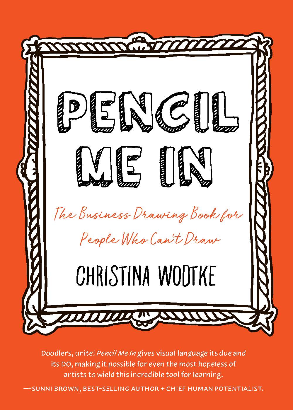
Want to get better in business? Learn how to draw.
There’s no faster, cheaper prototype in the world than a sketch on a sheet of paper. What’s unclear in words is suddenly crystal clear in a sketch, and you—and your team—can tackle problems in entirely new ways. Play around with ideas. Document your process. Think on paper. Visual thinking brings a whole new power to work.
Think you can’t draw? Don’t worry! The simplest sketches are the most effective at communication and problem solving, so you can begin drawing in less time than your average coffee break. Learn more, and purchase!
With contributions from Amelie Sarrazin, Aleksandra Micek, Taylor Reese, Dan Brown, Daniel Cook, Kate Rutter, Eva-Lotta Lamm, Matthew Magain, Sunni Brown, Cristina Negrut, Daryl Meier Fahrni, Marc Bourguignon, Laura Klein, David Gray, Melissa Kim, Mike Rohde, Brian Gulassa, Andrew Reid, Rolf Faste, Raph Koster, Stone Librande, Robin Hunicke, Alicia Loring, Erin Malone, Stephen P. Anderson, Giorgia Lupi, Alex Osterwalder, Noelle Stransky, James Young, and Dan Roam.

