or, Competitive Research the Creative Founder Way
For a long time, I’ve been disappointed by competitive research approaches. Most strike me as a bunch of bumbling around and seeing what you see… sometimes you write it down in a spreadsheet. Designers fixate on widgets, product managers take screenshot of pricing pages — without a diagnostics framework, it‘s haphazard and sub-optimal. I knew important things were being missed.
Over the years, I’d developed my own tricks for understanding the competitive landscape, but I wasn’t doing much better. It took co-teaching with Kate Rutter to show me the grand picture.
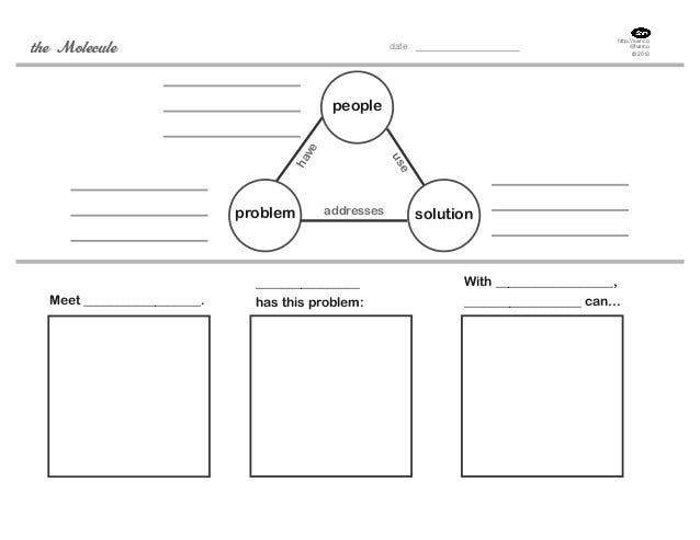
Kate uses The Molecule as a framing model for startup success. This was developed at LUXr, the first Lean UX firm, founded with janice fraser.

The molecule acts as a guide to answer three questions for your startup: who are your customers, what problem are they struggling with, and how is your offering going to solve it? This model also acts as our guide to our comparative research.
Note the term comparative. We won’t just look at competitors. We’ll look at other sorts of businesses that can inform our strategy beyond those who want to eat our lunch.
What Companies Are You Going to Examine?
So the reason we call it “comparative research” instead of “competitive research” is because there’s a lot to learn from products that are not direct competitors.
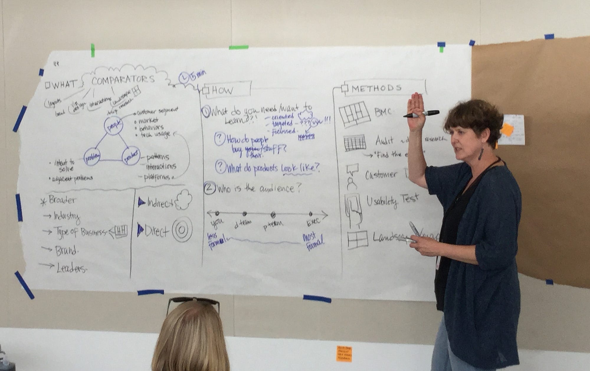
The molecule framework will guide how we’ll map the landscape:
People: Start with your market (remember, markets are made of humans!) What websites, apps and other environments do your potential customers spend time in? Are they PC or Mac? IOS or Android? Google has taught people search, Amazon defines how you shop, Netflix and Pandora recommend things to you. But if a potential customer has never used Pandora, what will they think if you borrow Pandora’s interaction metaphors? Is it learnable?
Be careful not to over-borrow: keep your design choices contextual to your product space. Just because people in your market spend time on Facebook doesn’t mean your product needs a newsfeed; it simply does mean the market know how one works(ish.)
(Does anyone really know how the Facebook newsfeed works?)
- Find companies to examine that your market loves.
Problem: What is the potential customer’s problem or opportunity they are trying to address? What are related problems? For example, job hunting. You have to find out who is hiring, but also how to make a resume, how to build a portfolio, how to manage references, how to interview well.
Or if someone wants to take a trip, they may decide where to go, how to budget it, how to get there, how to get around… by mapping the complete problem, you can find companies to examine that may not be direct competitors, but may be familiar to your audience or have something to teach you about the opportunity space.
- Find companies in related problem/opportunity spaces. Learn the interface language of your market (travel looks/feels/acts like this, fashion looks/feels/acts like this)
Solution: First, how do your potential customers currently solve their problem? What homegrown hacks have they developed? For example, a lot of people use email to track things like job or real estate opportunities by sending it to themselves. What are the advantages and disadvantages of this approach?
Now we look at competitors. How have other companies chosen to solve this problem? Which have found market success? Why? Who haven’t? Why not?
- Find your competition and understand them.
Finally stack rank the companies based on potential learning value. That’s subjective — discuss with the team. Most innovative? Investor’s darlings? Most popular? Highest traffic? Your call. Pick the top 5–10 to analyze. I’d start with five. Analysis paralysis is a real thing. Go wide in your initial review, narrow for deeper examination, then go wide again if necessary.
How to Approach Analysis
- What do I want to know?
Take a few minutes to write out questions you want answers to, or elements you want to look for. This will help you direct and standardize your assessments. Questions might include
* What do other products charge?
* What value does the other product highlight? How do they phrase that value?
* What is their business model?
* How do they handle customer service?
* What relationships do they have with customers? Email, forums, etc?
(Did you notice many questions are inspired by the business model canvas? Nice spotting!) - Walk about
I’ve made this mistake so many times: I make a beautiful spread sheet with all the topics I want to cover, then I carefully go through each site, and when I hit the third site… damn! Something interesting. I have to go back to the first two. Then when I hit the fifth site.. damn, another element I hadn’t considered!
I find it much more sensible to so a quick five minute walk through all the sites to make sure I’ve figured out what elements I want to consider and if the site is really doing what I think it is. The quick overview is more efficient that immediately diving in. - Inventory
Now you get to decide how thorough your inventory will be. Will you just jot down any interesting things you see, or carefully document every aspect of the company?
This choice depends on who the analysis is for. If you are doing it for a client or a boss, you’ll want to include screenshots, location markers (like URL) and detailed notes of what you found interesting and why. You can do this for yourself as well, though you don’t have to. I like to, because my memory is crap. Careful documentation writes the knowledge into my brain as well as making it transferable to my team.
Of course, when you’re in a hurry or deep analysis isn’t called for, you can do a light weight analysis. Then I open a notebook and just write down what I looked at and what I noticed. I never skip comparitive analysis because I think reinventing the wheel is silly. - Synthesis
This is the fancy design thinking term for looking for patterns in the data. It’s frequently done with post-its. You write down every insight you’ve gathered, one per post-it, then you sort them by similarity. I’ve written about the technique here. It is so tempting to skip thorough synthesis because it’s work, but if you don’t do it then you open yourself up to biased insights. You may see something just once and think it’s the right way to solve a problem, but in reality it’s not that common. When things are unusual, it could mean it’s innovative, or it could mean everyone else tried it and it didn’t work. If you don’t notice that it’s an unusual approach, you won’t ask the question: is it cool or dumb?
Don’t half-ass synthesis. Do it right. - Findings
If you are presenting your findings to a boss or an investor, you do not want to drag then through a chronological journey through your work. Start with your big findings, and leave the spreadsheet for the appendix. A simple top ten (or five) is plenty. Your messages is not, “I did a ton of work!” Your message is “I really understand the landscape.”
Visualize!
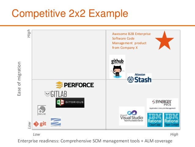
How to wrap up comparative research? Nothing says “I’m on top of things” like a 2×2! (or a petal diagram)

A competitive diagram is an overview of all the competitors, organized by how well they meet customer needs. It is shown either before the detailed analysis or at the end, as a summing up (or both.) It’s a also an argument to convince investors, team, etc that you are innovating in a way that will cause you to succeed.

If you want to make a useful 2×2, you have to ask “what are the axes?” What really matters to you end customer? What trade-offs do they make? The answer to what the axes is is also the answer to the question, what is our differentiating value? Why us?
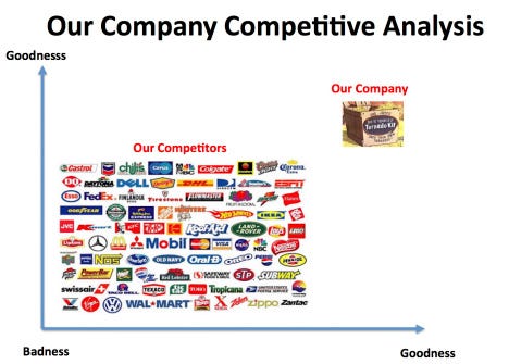
If you pick a simple axis like “reliable/unreliable,” you are obviously puffing yourself up to look impressive. Investors can see right through that. But a thoughtful axis like portable/full featured speaks to how you’ll segment the market in order to capture your target market.
Your customers (your future customers, if you are doing custoemr development) will tell you your value. When people make a decision about buying a product or service, how do they make it? price? quality? Breadth of choice? Functionality? Pick the top two, and make them the axes.
Be smart in your continuum choices. Cheap/expensive is ok, but Cheap/Luxury is smarter. The continuum are shouldn’t be as simple as bad and good, but involve a decision trade off, i.e. cheap/long lasting or cheap/good looking. Easy & limited vs powerful but has to be learned.
Your axes are your value proposition. Chose wisely.
Comparitive Methods
We’ve discussed the classic audit approach to comparitive research, but there are other ways to learn about the landscape.
Business Model Canvas: Building a BMC for key competitors can help you understand their success, and spot opportunities for disruption.
Competitive User Testings: You know (I hope!) about doing usability tests on your own product. Anything you do on your product can be done on competitors. Bring in your target market and have them use other people’s products. Note what works and doesn’t, from the trivial (dumb taxonomy) to the sublime (missing functionality.) The best part? You don’t have to spend a minute building an MVP to do it. Start learning before you start coding.
Teardowns: The master of the teardown is User Onboarding. This apporach is similar to an audit, but an even closer look at every single choice and why it was made. Save this for your arch-nemesis.
Conclusions
Comparitive analysis can accelerate your search for product market fit, if done well.
- Chose who you study wisely
- Use the molecule to structure your analysis
- Be analytical and not sloppy in your analysis. It is worth doing and it is worth doing right.
- Be clear on what your value is, and be honest with yourself about your competition.
Much love to Kate Rutter and the 2019 Creative Founder class. This essay, started last year, is for you.

Some interesting articles
https://steveblank.com/2013/11/08/a-new-way-to-look-at-competitors/
http://tomtunguz.com/ecosystem-vs-competition/
http://www.flowventures.com/competitive-analysis-for-startups-the-goal/